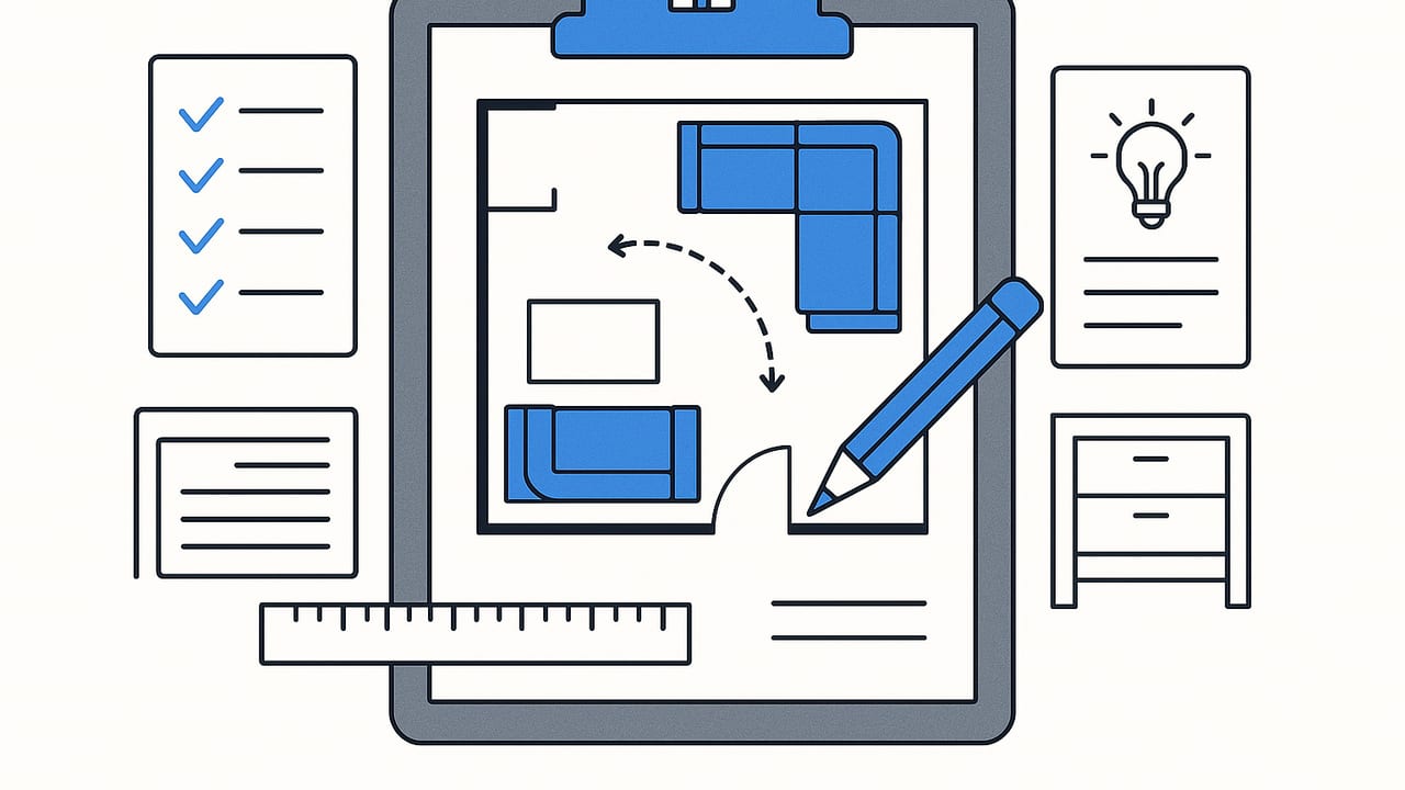
A great home doesn’t happen by accident. It’s the result of a clear process that turns constraints into smart choices. Whether you’re refreshing a single room or rethinking an entire apartment, a robust home planner workflow will save time, reduce changes mid-project, and protect your budget. This guide walks you through a practical, repeatable approach used by pros—adapted for homeowners, renters, and DIY renovators who want dependable results.
A 7-Step Home Planner Workflow
1) Define goals, constraints, and your brief
Before you draw a line or buy a chair, write a one-page project brief. You’ll use it to make faster decisions later. Keep it short but specific.
- Goals: e.g., create a quiet WFH zone, increase seating for six, add concealed storage.
- Constraints: budget, timeline, structural walls, rental rules, natural light direction, pets, kids.
- Must-haves vs nice-to-haves: rank them. Compromises will happen—decide in advance where.
- Style cues: 3–5 words only (calm, warm wood, matte black, textural). Clarity beats mood-board overload.
Decision rule: If a choice doesn’t serve the brief, it’s probably noise.
2) Measure and verify the existing space
Good measurements are the backbone of every home planner move. Use a tape or laser, plus graph paper or a notes app.
- Measure walls corner to corner, plus heights.
- Record openings: doors (width, swing direction), windows (width, sill height), radiators, columns.
- Note fixed services: outlets, switches, HVAC grilles, plumbing locations.
- Cross-check diagonals to verify a room is square; if not, note the out-of-square angle or difference.
“Measure twice, plan once.” A 1–2 inch error can break a layout; a 10-minute recheck can save a weekend.
3) Digitize your base plan
Sketch the room to scale (1 square = 1 foot or 10 cm). If you have a printed floor plan, scan or photograph it flat in good light. Create a clean, black-and-white version for clarity. You can draft in your favorite app or keep it analog—what matters is accuracy and legibility. A digital base makes it easy to iterate, duplicate options, and layer furniture, lighting, and finishes without redrawing.
4) Zone the space and map adjacencies
Good rooms support activities. Zoning groups related activities; adjacency ties those zones together. Start with three buckets:
- Public: living, dining, entry
- Private: bedrooms, study, nursery
- Service: kitchen, laundry, storage
Then sketch relationships. Here’s a simple adjacency matrix you can tweak:
| Zone | Entry | Living | Dining | Kitchen | Bedrooms | Bath | Laundry |
|---|---|---|---|---|---|---|---|
| Entry | — | High | Medium | Low | Low | Low | Low |
| Living | High | — | High | Medium | Low | Low | Low |
| Dining | Medium | High | — | High | Low | Low | Low |
| Kitchen | Low | Medium | High | — | Low | Medium | Medium |
| Bedrooms | Low | Low | Low | Low | — | High | Low |
| Bath | Low | Low | Low | Medium | High | — | Medium |
| Laundry | Low | Low | Low | Medium | Low | Medium | — |
Use this to decide what should be adjacent, nearby, or separated—and where doors and openings make the most sense.
5) Lay out furniture and preserve clearances
A home planner lives or dies by clearances. Below are common comfort ranges that keep circulation smooth:
| Situation | Typical Clearance | Notes |
|---|---|---|
| Major circulation path | 36–42 in (90–105 cm) | Primary route through a room |
| Between sofa & coffee table | 16–18 in (40–46 cm) | Comfortable reach |
| Dining table edge to wall | 36–44 in (90–112 cm) | Pull-out + pass behind seated person |
| Bed side clearance | 24–30 in (60–76 cm) | Both sides if possible for shared beds |
| Desk & chair clearance | 42–48 in (105–122 cm) | Chair slide + passer-by |
| Door swing arc | Clear full radius | Avoid blocking with furniture corners |
Test multiple arrangements. Label each option A, B, C and annotate pros/cons right on the plan. Keep traffic paths unbroken, especially from entry to main seating and from kitchen to dining.
6) Light, sightlines, and focal points
Great layout isn’t just about fit; it’s about experience. Identify where daylight comes from and protect those view corridors. Anchor each room with a focal point—fireplace, TV wall, art, a window—and align seating accordingly.
- Sightlines: From entry, can you see the main seating? From sofa, can you see the window or media wall? Avoid tall storage blocking views.
- Layered lighting: ambient (ceiling), task (lamps, under-cabinet), accent (picture lights). Dimmer control extends function.
- Glare check: Position screens perpendicular to windows if possible; use curtains or shades to modulate daylight.
7) Dial in furniture, storage, and finishes
A balanced room allocates volume to seating, circulation, and storage. A simple guideline for multi-use living rooms:
- Circulation: 30–35% of floor area
- Primary seating: 35–45%
- Storage & display: 15–25%
- Free space/flex: 5–10%
Choose a restrained palette. Repeat 1–2 wood tones and 2–3 fabric colors across the room for cohesion. Use durable finishes in high-touch areas and add one tactile element (bouclé, leather, slatted wood) for depth.
Quick Math for a Smarter Home Planner
These fast calculations help validate layouts before you buy anything.
1) Furniture-to-circulation ratio
Target: 65:35 (furniture:corridors) in living spaces. If corridors exceed 40%, your room might feel empty; below 25% may feel cramped.
furniture_area = total_room_area - measured_circulation_paths
ratio = furniture_area / total_room_area
2) Seating capacity test
For a rectangular living room, add up linear seating edge (sofas + chairs) and divide by 24 in (61 cm) per person for comfortable spacing.
seating_capacity = total_linear_edge_in / 24
3) Rug sizing baseline
- Living room rug: leave 8–18 in (20–46 cm) border to walls; front legs of sofas/chairs on the rug.
- Dining rug: extend 24 in (61 cm) beyond table edge on all sides to accommodate pulled-out chairs.
4) Desk and screen ergonomics
- Eye-to-screen distance: ~20–30 in (50–75 cm)
- Top of screen at or slightly below eye level
- Task lighting aimed from the opposite side of your dominant hand to reduce shadows
Three Home Planner Scenarios (Worked Examples)
Scenario A: 400 sq ft studio
Brief: Sleep, lounge for two, compact dining for two, WFH corner, max storage, keep room bright.
- Zoning: Place bed along the darkest wall; orient sofa toward window for depth. Use an open bookshelf as a partial divider to preserve light and sightlines.
- Furniture: 60–72 in sofa, 36 in round drop-leaf table, two stackable chairs, 48 in desk against a wall.
- Clearances: Keep a 36 in path from entry to window; maintain 24–30 in on bed sides.
- Storage: Under-bed drawers + 24 in deep wardrobe; use vertical space above doors.
Tip: Choose a rug that stabilizes the lounge zone; align desk near a window for daylight without glare.
Scenario B: 12' x 18' living-dining combo
Brief: Seat 5–6, dine for 4–6, TV visible, maintain flow to balcony.
- Layout: Place sofa on the long wall opposite focal point; float two lounge chairs to define a conversation area. Use a 60 in oval dining table near the kitchen edge for tighter circulation.
- Paths: Ensure a 36–42 in clear path from entry to balcony; keep 40 in between sofa back and dining chairs.
- Lighting: Pendant above table (dimmable), floor lamp behind sofa, accent picture light over artwork.
Tip: Oval and round tables ease circulation in compact combos.
Scenario C: 9' x 10' bedroom + workspace
Brief: Queen bed, small desk, 2-door closet access, calm atmosphere.
- Layout: Center bed on longest wall; 24–28 in side clearances. Place a 36–42 in wide desk opposite a window to reduce screen glare.
- Storage: Shallow 12–14 in shelves above desk; closed nightstands to hide cords and devices.
- Acoustics: Use a plush rug and curtains; fabric headboard softens reflections.
Tip: If a door swing conflicts with furniture, consider swapping to a pocket or barn door where feasible.
Common Home Planner Pitfalls (and Fixes)
- Overfurnishing: Too many pieces reduce walkability. Fix: Choose fewer, larger items with storage (e.g., drawers in coffee table).
- Ignoring door swings: Doors clip corners or block drawers. Fix: Draw swing arcs and keep them fully clear.
- No focal point: Rooms feel aimless. Fix: Decide the feature wall or window hierarchy first, then place seating.
- One-note lighting: Only one overhead fixture. Fix: Add task and accent layers; dimmers for mood and energy savings.
- Blocking daylight: Tall storage against key windows. Fix: Keep window wall low; use mirrored or light finishes to bounce light.
- Scale mismatch: Tiny rug or undersized art. Fix: Rug edges under front legs; art at 57–60 in center height; group small pieces into a larger composition.
Tools Checklist for Any Home Planner
- Tape measure or laser measure
- Painter’s tape (to mark furniture footprints on the floor)
- Graph paper or a tablet with a stylus
- Phone camera for site photos, window orientations, and outlet locations
- Color swatches and material samples under daylight and warm evening light
- Extension cords, outlet splitters for mock-ups
- Lightweight cardboard to simulate furniture footprints
When to Move from 2D Plans to 3D Views
2D plans are perfect for measurements and adjacency. But many decisions—sofa back height, pendant drop, how light wraps around a tall cabinet—benefit from 3D. Switch to 3D when:
- You’re unsure about furniture heights and how they affect sightlines.
- You’re balancing multiple vertical elements (pendants, shelving, curtains).
- You need to test color/material combinations in context.
- Stakeholders (family, clients, roommates) need a shared visual to agree.
Best practice: Keep your 2D base plan as a single source of truth (dimensions), then iterate options in 3D for speed. If you already have a black-and-white floor plan, an iOS app like Floor Plan to 3D can convert it into a true-to-scale 3D model so you can visualize layouts, preserve proportions, and export high-resolution images for proposals or presentations.
Printable Mini-Templates
Project brief (fill-in)
- Goals: ___________________
- Constraints: ___________________
- Must-haves: ___________________
- Nice-to-haves: ___________________
- Style cues (3–5): ___________________
Room validation checklist
- All walls, openings, and heights measured and verified
- Door swings drawn and clear
- Primary circulation path marked at 36–42 in
- Furniture placed with clearance table validated
- Sightline from main seat to focal point confirmed
- Window glare check for screens complete
- Lighting layers listed (ambient, task, accent)
- Storage volume tallied against needs
Final Thoughts
Great home planning favors clarity over clutter and process over impulse. Start with a brief, measure meticulously, zone intelligently, protect circulation, honor light, and keep finishes cohesive. When you need to see height, volume, and shadows, step into 3D to validate your choices before you commit. The more faithfully you follow a simple home planner workflow, the more confident—and comfortable—your spaces will be.
