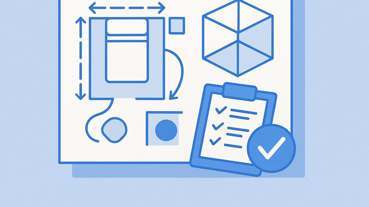
Room planning is the craft of arranging space so it works as beautifully as it looks. Whether you are laying out a living room, bedroom, or home office, good layouts follow ergonomic clearances, visual logic, and clear circulation—then get validated in 3D before money is spent. This guide distills the essentials into practical rules, ready-to-use dimensions, and simple metrics you can apply immediately.
Start With Purpose and Zones
Every effective room planning workflow begins with purpose. Define the primary activities the room must support, then group them into zones. Zoning clarifies what belongs where and protects flows between activities.
- Main activities: conversation, media viewing, sleeping, working, dining, exercising.
- Support activities: storage, charging, reading, hobby setup, pet areas.
- Adjacency: place high-frequency activities close together; separate noisy from quiet zones.
Sketch the room outline and mark fixed elements first (doors, windows, radiators, built-ins). Anchor major pieces to these realities—then plan transitions: how someone enters, where eyes rest, and where feet naturally walk.
Dimensions That Matter: Core Ergonomics
Clearances are the backbone of room planning. The table below summarizes field-tested dimensions to keep layouts comfortable and safe. Use “Preferred” where possible; fall back to “Minimum” only when space is tight.
| Element | Minimum | Preferred | Notes |
|---|---|---|---|
| Main circulation path width | 36 in (915 mm) | 42–48 in (1065–1220 mm) | Primary routes serving entries/doorways |
| Secondary circulation | 30–32 in (760–815 mm) | 36 in (915 mm) | Between furniture within a zone |
| Sofa to coffee table | 14 in (355 mm) | 16–18 in (405–455 mm) | Comfortable reach for drinks, remotes |
| Front of TV to seating | ~1.0× diagonal (4K) | 1.0–1.5× diagonal | Use lower factor for higher resolution screens |
| Dining chair pull-back | 30 in (760 mm) | 36–48 in (915–1220 mm) | Clear wall/other furniture behind diners |
| Bed side clearance | 24 in (610 mm) | 30–36 in (760–915 mm) | For nightstands and easy bed making |
| Desk chair clearance | 30 in (760 mm) | 36 in (915 mm) | From desk edge to obstruction behind |
| Door swing clearance | 32 in arc | 36 in arc + 12 in latch side | Keep swings off circulation paths when possible |
| Kitchen work aisle | 42 in (one cook) | 48 in (two cooks) | Applies to galley or island configurations |
| Turning circle (wheelchair) | 60 in diameter | — | Plan inclusive spaces where feasible |
These values come from ergonomics, building guidelines, and design practice. Always reconcile them with the site’s constraints and local code requirements.
Flow and Circulation: Design Movement First
Great layouts “read” in a single glance because circulation has been resolved first. When people can move intuitively, the space feels larger and calmer.
- Entry line of sight: establish a focal point visible from the door (art, window, fireplace). It sets orientation and reduces visual clutter.
- Continuous paths: paths should not zigzag between furniture edges; align at least one clear 36–42 in axis.
- Door choreography: avoid placing large seating directly in swing arcs; place rugs so they don’t clip door swings.
- Diagonal relief: allow at least one path that moves diagonally if the room is long and narrow; it reduces “bowling alley” effect.
Think in layers: primary circulation (entry-to-destinations), then secondary circulation (within zones). If you can trace these paths without touching furniture outlines, the plan is likely comfortable.
Scale, Measurement, and Tolerances
Room planning succeeds when measurements are reliable. Measure the shell first, then the “invisible” constraints:
- Shell: wall-to-wall lengths, ceiling height, window/door sizes and sill/head heights.
- Obstacles: baseboard depth, radiators, vents, sloped ceilings, outlets, switches.
- Tolerances: expect ±1–2% variability in older buildings; validate diagonals for squareness.
Record dimensions in a consistent unit system and label your sketch. Before purchasing, mock up footprint with painter’s tape or cardboard templates to confirm clearances under real-world conditions.
Furniture Strategy: Anchor, Balance, Iterate
Start with the largest functional piece in each zone, then counterbalance it:
- Anchor: place the sofa or bed first, respecting focal points and circulation.
- Balance: offset mass with a secondary piece (armchairs across from sofa, dresser opposite bed).
- Function: add tables, task lights, and storage where hands and eyes need them.
- Fine-tune: adjust gaps to hit preferred clearances; bump to minimums only if necessary.
Use “placeholder blocks” at actual sizes before committing to specific products. In 3D, swap variations quickly (e.g., two small chairs vs. one large chair) to see which preserves sightlines and flow.
Lighting Layers and Focal Hierarchy
Lighting supports the room’s story and function. Layer it:
- Ambient: uniform base light (ceiling fixtures, cove lighting). Target an even distribution.
- Task: brighter, localized light (desk lamp, reading sconce) set within the activity’s zone.
- Accent: highlight focal elements (art, plants, textures) to create depth.
Place dimmers on ambient layers, and choose warmer color temperatures for living/sleeping zones. In 3D visualization, test light placement and glare; ensure task light doesn’t shadow the work surface.
Acoustics, Materials, and Comfort
Material choices shape comfort beyond aesthetics:
- Absorption: rugs, upholstery, curtains reduce echo and improve conversation clarity.
- Reflections: glossy floors and large windows can cause harsh reflections; balance with soft finishes.
- Zoning via materials: define a reading nook or workspace with a different rug or wall texture to anchor the zone visually and acoustically.
Remember thermal comfort: avoid blocking radiators with large furniture; consider radiant surfaces when placing seating.
Data-Driven Layout Checks
After you draft a plan, stress-test it with simple metrics. A few useful ones:
- Circulation ratio: circulation area divided by net usable area. Aim for 0.25–0.35 in most living spaces (higher in highly trafficked rooms).
- Seating utilization: number of comfortable seats facing the focal point within acceptable viewing angles (±30–35°), divided by total seats. Aim for 0.8+ for conversation/media rooms.
- Reach efficiency: share of frequently used items within a single step (within ~30 in reach) of their activity zone. Higher is better for workspaces.
If you like quick calculations, here’s a tiny example to validate TV viewing distance and basic circulation efficiency:
# Simple planning helpers (units in inches unless noted)
def tv_view_distance(diagonal_in, resolution="4K"):
    factor = 1.0 if resolution.upper() == "4K" else 1.5
    inches = diagonal_in * factor
    return round(inches / 12, 1)  # feet

def circulation_efficiency(circulation_sqft, net_usable_sqft):
    if net_usable_sqft == 0:
        return 0.0
    ratio = circulation_sqft / net_usable_sqft
    return round(1 - ratio, 2)  # higher is better

# Examples:
# 65" 4K TV recommended distance (feet):
print(tv_view_distance(65, "4K"))  # ~5.4 ft

# If 90 sqft is paths and 260 sqft is net usable:
print(circulation_efficiency(90, 260))  # ~0.65 (65% of space actively used)
Room Planning Patterns by Room Type
Living Room
- Conversation first: arrange seats so eye lines intersect at ~8–10 ft for groups, 6–8 ft for small gatherings.
- Primary path: keep one 36–42 in lane from entry to seating zone and to any balcony/door.
- Media wall: center the TV or art on the long axis; provide 16–18 in reach to a surface from each seat.
Bedroom
- Bed wall: place the headboard opposite the entry or perpendicular to it; maintain 24–36 in on both sides.
- Storage access: ensure 36 in in front of wardrobe/dresser drawers for comfortable opening.
- Lighting: pair ambient with two task lights; set switches within arm’s reach of bed for safety.
Home Office
- Desk orientation: face a wall or window offset to avoid screen glare; keep 36 in behind the chair.
- Cable/charging: plan outlets and cord paths; mount a power strip under-desk to reduce floor clutter.
- Video framing: in 3D, test camera views for calls; keep a simple, well-lit background.
Common Mistakes (and Simple Fixes)
- Undersized rugs: a rug that floats under the coffee table makes the room feel smaller. Fix: front legs of all major seating on the rug.
- Cluttered entrances: console tables too deep near the door reduce path width. Fix: choose 10–12 in deep tables or wall shelves.
- Blocking natural light: tall storage near windows can kill daylight reach. Fix: keep low pieces within 24–30 in near glazing.
- No landing zones: places to set things down within 16–18 in of seating are essential. Fix: add side tables or wall shelves.
Validate in 3D Before You Buy
Visualizing in 3D exposes issues drawings miss: sightlines, glare, and how volumes feel. When validating:
- True scale: ensure models reflect real product dimensions, including overhangs and handles.
- Eye-level views: check from 42–48 in camera height; then sit-level views around 36 in for living rooms.
- Lighting tests: simulate day and night; watch for reflections on screens and task surfaces.
- Export angles: capture orthographic plans and perspective views so stakeholders see both function and feel.
Room Planning Checklist
- Define primary and secondary activities; draw zones.
- Measure shell, openings, and obstacles; note tolerances.
- Resolve circulation first; confirm one clear 36–42 in path.
- Place anchor furniture; adjust to meet preferred clearances.
- Layer lighting: ambient, task, accent; add dimmers.
- Audit storage and landing zones near each activity.
- Validate with data: circulation ratio, viewing angles, reach.
- Review in 3D; test multiple configurations and heights.
Quick Reference: Typical Room Scenarios
| Scenario | Key Moves | Watch-outs |
|---|---|---|
| Narrow living room | Float sofa off wall; use slender arms; maintain a central 36 in path | Oversized coffee table; deep media consoles |
| Square living room | Create an L-shaped conversation group; define zones with rugs | Dead center seating that blocks all paths |
| Small bedroom | Opt for wall-mounted lights; 24–30 in beside bed; sliding doors on wardrobes | Swing doors colliding with nightstands |
| Corner home office | Desk facing wall with side daylight; acoustic panel behind monitor | Glare from direct window; cramped chair clearance |
Putting It All Together
Room planning blends measurable comfort with aesthetic intention. Start with purpose, protect circulation, and honor ergonomic clearances. Use zoning to tame noise, clutter, and competing priorities. Then validate the design in 3D to expose blind spots and gain confidence before you commit.
\u201cMeasure twice, place once.\u201d Your tape, your clearances, and a quick 3D check will save you returns, frustration, and layout regret.
Ready to visualize your measured plan without rebuilding it from scratch? Tools that convert a flat floor plan into a true-to-scale 3D space can accelerate iteration and catch issues early\u2014for example, the iOS app Floor Plan to 3D can transform black-and-white plan images into navigable 3D layouts you can test and export for proposals.
