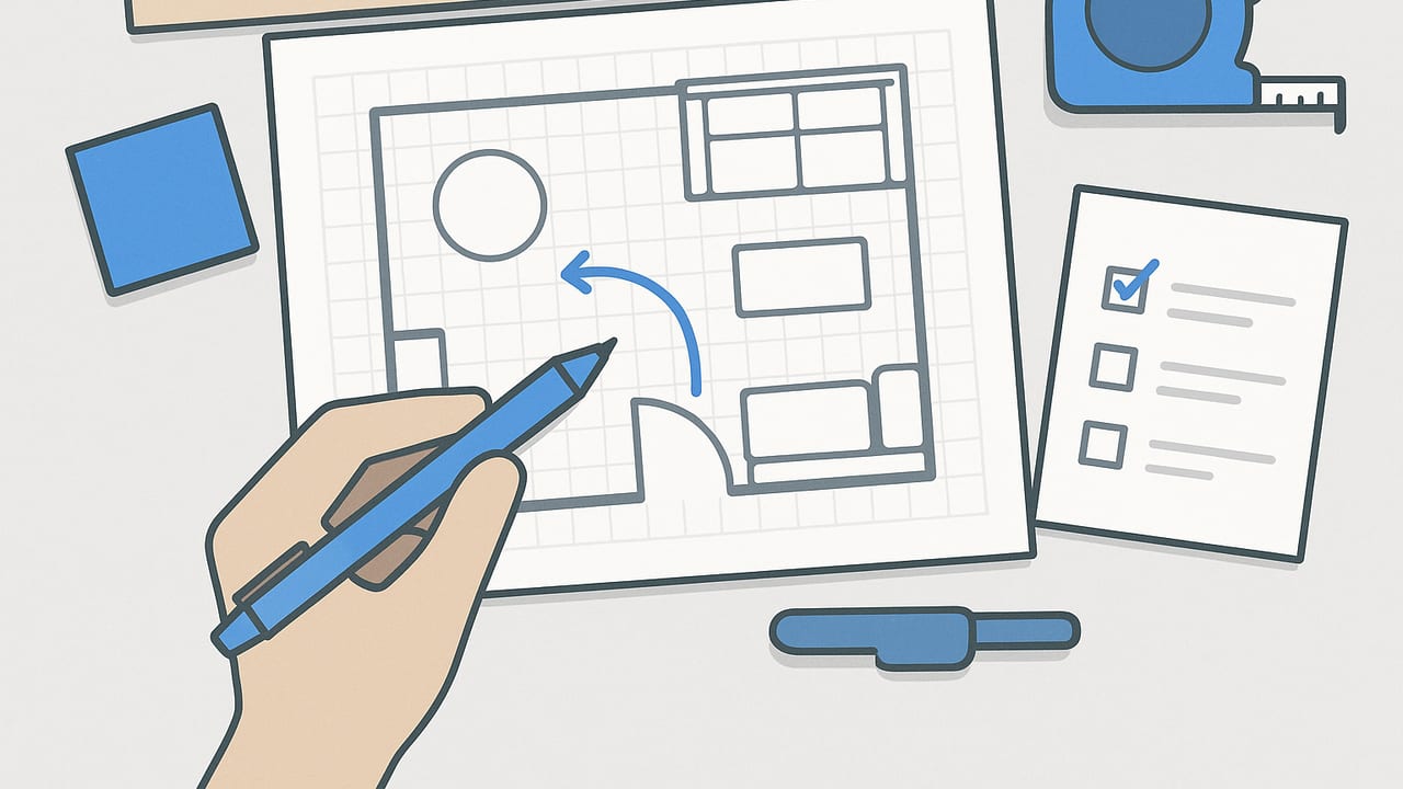
A great room layout isn’t about cramming furniture into a footprint; it’s about balancing function, comfort, and proportion so the space works in real life. If you’ve ever tried to use a room layout planner and felt overwhelmed by options, measurements, and trade-offs, this guide is for you. Below, you’ll find the essential dimensions, a repeatable workflow, common mistakes to avoid, and practical tips that help you move from guesswork to confident planning.
Start With Outcomes: What Your Room Must Do
Before dragging a sofa around a digital plan, clarify the outcomes the space needs to support. Good planning begins with constraints and goals:
- Primary functions: Conversation, watching TV, reading, dining, working, sleeping, exercising.
- People and frequency: How many people use the room daily? How many guests occasionally?
- Storage needs: Hidden (closets, credenzas) vs. open (shelves, display).
- Lighting and mood: Task lighting for work; ambient lighting for relaxation.
- Non-negotiables: Fireplace viewing, window access, door swing, radiators or vents, outlets.
Write these down. Your room layout planner works best when your priorities steer the geometry—not the other way around.
The Numbers That Make Rooms Comfortable
Most planning errors trace back to ignoring clearances and scale. Use these field-tested benchmarks to sanity-check your plan. Treat them as ranges—adjust for your household and furniture size.
| Element | Recommended Dimension | Notes |
|---|---|---|
| Main walkway (circulation) | 36–42 in (90–107 cm) | Primary paths between doors and key zones |
| Secondary path around furniture | 30–36 in (76–90 cm) | Edges of sofas, beds, tables |
| Sofa to coffee table | 14–18 in (36–46 cm) | Comfortable reach without knee-bumping |
| TV viewing distance | 1.5–2.5× screen diagonal | Adjust for 4K detail; avoid neck strain |
| Dining chair to wall/obstruction | 36 in (90 cm) minimum | 48 in (122 cm) for wheelchair access |
| Bed sides clearance | 24–36 in (61–90 cm) | Master bedroom comfort; smaller in tight rooms |
| Door swing clearance | Arc + 2 in (5 cm) | Keep furniture out of the swing path |
| Desk + chair zone | 60–66 in depth (152–168 cm) | Desk depth + chair + push-back room |
| Area rug under sofa | Front legs on rug (6–12 in overlap) | Unifies seating; avoid “postage stamp” rugs |
“Design lives and dies in the inches you can’t see on a mood board.”
A Repeatable Room Layout Planner Workflow
Use this six-step process to move from measuring to a final layout you can trust. It works for living rooms, bedrooms, offices, or multipurpose spaces.
1) Capture the Envelope
- Measure the shell: Wall-to-wall, ceiling height, soffits, alcoves, columns.
- Locate openings: Doors (swing direction), windows (sill height), radiators, vents.
- Note utilities: Outlets, switches, internet ports, TV mount points.
- Draw to scale: Use graph paper at 1 square = 6 in (15 cm) or a digital grid in your room layout planner.
2) Map Constraints and Sightlines
- Traffic: Sketch the natural paths between doorways and focal zones.
- Sunlight: Where does direct light fall? Consider glare on screens and fading on fabrics.
- Sightlines: What do you see when you enter? Highlight or conceal views accordingly.
3) Zone the Room
- Bubble diagram: Group activities (conversation, dining, work) as circles sized by importance.
- Adjacencies: Place related zones near each other (desk near daylight and outlets; dining near kitchen).
- Noise and privacy: Bedrooms and workstations away from primary traffic and speakers.
4) Draw Clearances First
- Walkway bands: Lay in 36–42 in paths before placing furniture.
- Door arcs: Add arcs; keep them free.
- Service space: Include swing/slide for drawers, appliances, and cabinet doors.
5) Place Anchor Pieces
- Largest items first: Sofa, bed, dining table, desk. Ensure clearances remain intact.
- Orientation: Align with focal points (fireplace, TV, view) while minimizing glare and echo.
- Balance: Avoid all mass on one side—use pairs or a credenza to counterweight.
6) Layer Lighting, Storage, and Softness
- Lighting: Every zone needs task + ambient + accent. Place lamps where they actually plug in.
- Storage: Size for what you own; leave 1–2 in breathing room on shelves.
- Soft finishes: Rugs to define zones; curtains to control glare; acoustic panels if echo is an issue.
Quick Scale Math You’ll Actually Use
Whether you plan on paper or digitally, consistent scale keeps you honest. Here’s a simple approach:
- Paper: 1 square = 6 in (1:24). A 12 ft wall = 24 squares. Outline the envelope, then trace furniture cutouts to scale.
- Digital: Set your room layout planner grid to a known unit and lock the scale. Import a scanned plan and calibrate one known dimension (e.g., wall length) to eliminate printer distortion.
// Convert real-world inches to pixels for a consistent digital scale
// Example: 1 in = 2.5 px (adjust to your canvas size)
function scaleToPixels(inches, pixelsPerInch = 2.5) {
  return Math.round(inches * pixelsPerInch);
}

// A 72-inch sofa at 2.5 px/in = 180 px
drawSofa(widthPx = scaleToPixels(72), depthPx = scaleToPixels(36));
Room-by-Room Layout Rules of Thumb
Living Room
- Conversation radius: Seat edges within ~8 ft (2.4 m) to avoid shouting.
- Anchor: Place the sofa first; float it if the room is deep to create two zones (e.g., lounge + reading).
- Media wall: Center line of TV ~40–48 in from floor when seated viewing is primary; confirm distance with screen size.
- Flanking balance: Use side tables or chairs to prevent a heavy-left or heavy-right composition.
Bedroom
- Bed wall: Ideally uninterrupted, away from door drafts and glare.
- Clearances: 24–36 in on each side; 36 in at foot if it’s a main path.
- Storage: Measure dresser drawer extension; leave 20–24 in for crouching access.
- Lighting: Sconces at 5–7 in above mattress top; dimmers for wind-down.
Home Office
- Desk orientation: Face a wall or window offset 90° to reduce glare and distraction.
- Cable plan: Route to outlets; avoid cords across walkways.
- Acoustics: Add soft surfaces behind the microphone; bookshelves help diffuse sound.
- Camera framing: If you take calls, test your background and light.
Small Spaces and Studios
- Dual-purpose pieces: Storage ottomans, drop-leaf tables, sleeper sofas.
- Vertical zones: Shelves above desks; curtains or slatted screens to visually separate sleep and lounge zones.
- Scale: Fewer larger pieces beat many tiny ones—less clutter, more presence.
Common Mistakes—and Easy Fixes
- Ignoring door arcs: Fix by tracing every swing and leaving a buffer. Consider pocket or barn doors where feasible.
- Too-small rugs: Fix by sizing so front legs of seating sit on the rug; extend under the coffee table.
- Blocking windows: Fix by lowering backs of furniture near sills; avoid tall cases in front of light sources.
- No circulation plan: Fix by drawing primary paths first; rehome furniture that narrows routes below 30 in.
- Scale mismatch: Fix by templating in scale—cut paper or digital blocks—and testing three size options before buying.
Evaluate Your Plan: A 10-Point Checklist
Use this quick checklist before you commit to a layout or purchases:
- Primary function is obvious and unobstructed.
- Main walkway is 36–42 in clear from door to focal zone.
- All doors and drawers open fully without collisions.
- Seating conversation area fits within an ~8 ft radius.
- TV distance matches 1.5–2.5× the screen diagonal.
- Bed has 24–36 in on each accessible side.
- Dining chairs have 36 in minimum behind them.
- Task, ambient, and accent lighting are each present.
- Outlets are reachable; no cords in pathways.
- At least one alternate layout has been tested for comparison.
Using Digital Tools with Confidence
A room layout planner shines when you pair accurate measurement with quick iteration. A few tips:
- Start with real dimensions: Calibrate your plan to a measured wall. Snap furniture to a grid for clean alignment.
- Build a block library: Create to-scale blocks for your specific sofa, bed, dining table, and storage pieces. Label widths and depths.
- Iterate fast: Save variants A/B/C with different anchor orientations. Compare by printout or side-by-side on screen.
- Switch views: Top-down planning finds collisions; 3D views reveal sightlines, glare, and awkward heights.
If you already have a clean 2D floor plan, the iOS app Floor Plan to 3D can convert it into a true-to-scale 3D scene that preserves dimensions, making it easier to visualize furniture, check clearances, and export high-resolution images for presentations.
Pro Tips That Elevate Any Layout
- Echo control: Large rugs and curtains reduce slap echo in hard-surface rooms.
- Symmetry vs. balance: Perfect symmetry can feel stiff; aim for visual balance through mass and height.
- Layer heights: Mix low seating, mid credenzas, and tall bookcases to guide the eye upward.
- Sightline editing: Place tall plants or screens to shape views from entries without blocking light.
- Test the 80% rule: Furniture that fills roughly 80% of a zone reads intentional while leaving breathing room.
Putting It All Together
The best layouts are designed, tested, and verified—not guessed. Start with your outcomes, measure precisely, respect clearances, and iterate with a disciplined workflow. Use your room layout planner to explore alternatives, then pressure-test sightlines, lighting, and real-world movement. When you commit, you’ll know your furniture fits, the space flows, and the room supports the life you want to live.
