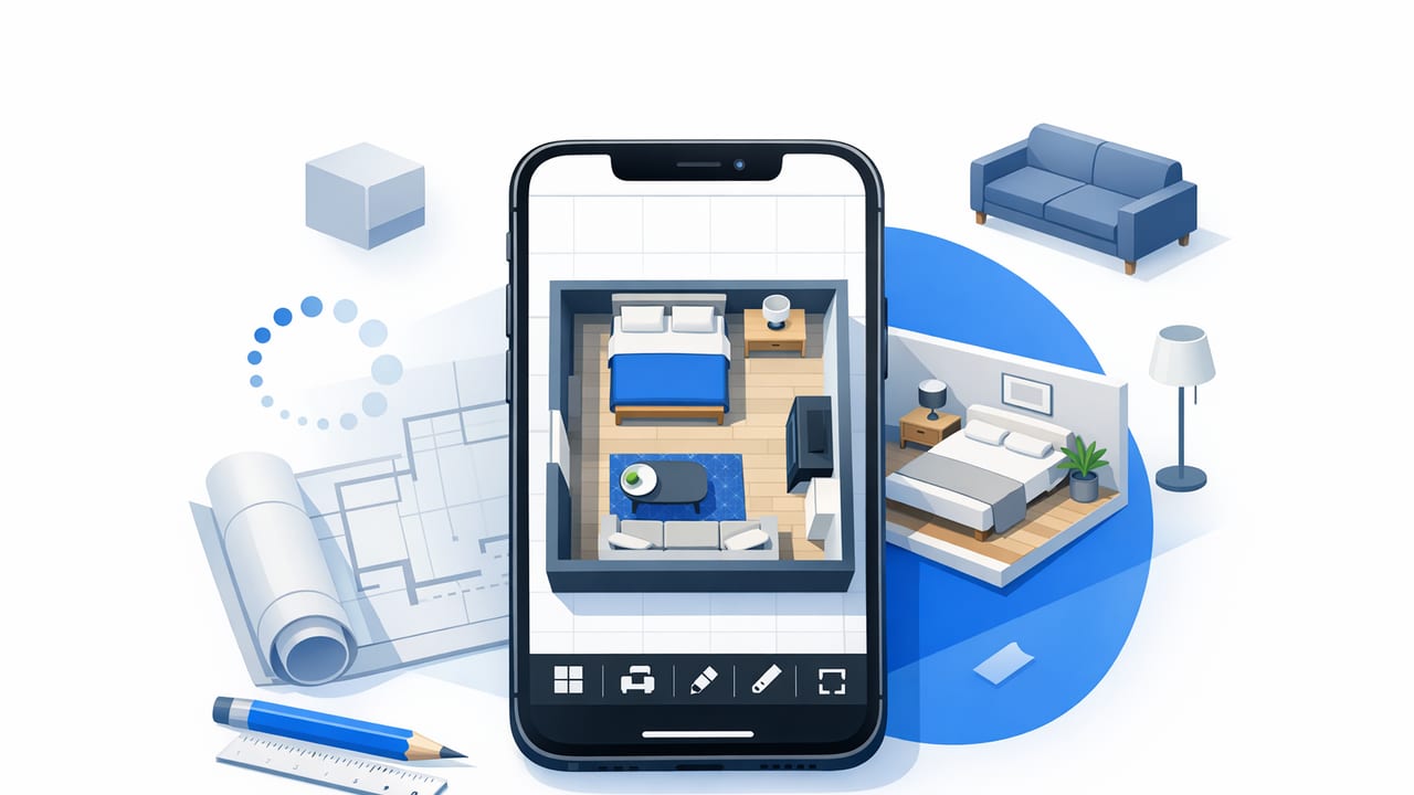
Most layout mistakes happen long before a contractor shows up—usually at the “it should fit” stage. An ios room planner bridges that gap by turning a static floor plan into a space you can test: sightlines, clearances, furniture scale, and alternative layouts. When you add AI-assisted 2D-to-3D conversion, you can move from a black-and-white drawing to a realistic model quickly, while still keeping dimensions and proportions consistent.
This guide walks through a practical, accuracy-first workflow: how to capture a floor plan, calibrate scale, validate room geometry, create reliable 3D views, and export visuals that stakeholders can actually use.
Why iOS room planning works best when accuracy comes first
A 3D model is only helpful if it reflects the real constraints of the space. Accurate room planning reduces:
- Rework (moving outlets, shifting cabinetry, resizing furniture orders)
- Decision fatigue (too many options without measurable tradeoffs)
- Communication gaps between homeowners, designers, and builders
The key is to treat your iOS room planner like a lightweight “visualization pipeline,” not just a sketchpad: clean input → verified scale → validated geometry → scenario testing → export.
Step 1: Prepare the 2D floor plan for clean scanning
AI conversion tools perform best when the plan is legible. Before you scan or photograph:
- Flatten and brighten: remove creases; use even lighting to avoid shadows.
- Increase contrast: black lines on white paper work best; avoid busy backgrounds.
- Remove distractions: sticky notes, hand-written notes over walls, and fingerprints can confuse edge detection.
- Include at least one known measurement: a labeled wall length, a doorway width, or a scale bar.
Recommended capture checklist (iPhone/iPad)
- Place the plan on a flat surface near a window (indirect light).
- Hold the camera parallel to the page (avoid keystone distortion).
- Fill the frame with the plan and keep corners visible.
- Take two shots: one wide, one closer for dimension labels.
Tip: If you can’t avoid perspective distortion, capture slightly wider than needed. Cropping later is easier than correcting warped corners.
Step 2: Choose a scaling method (and stick to it)
Every reliable ios room planner workflow needs a single “source of truth” for scale. Common approaches:
- Known wall length (best): choose the longest labeled wall to reduce percentage error.
- Door width (good): standard doors are often 30–36 in (762–914 mm), but verify if possible.
- Architect scale (good if printed properly): use the scale note only if you trust the print size.
Even if an AI tool detects walls automatically, you still want to confirm at least two measurements in different directions (e.g., a long horizontal wall and a vertical wall). That quickly reveals stretch or skew.
Quick scale math (when you need it)
If you’re calibrating from an image manually, here’s a simple way to reason about scale using pixels:
// Given: a reference wall is 144 inches in real life
// and measures 960 pixels in the scanned image

pixelsPerInch = 960 / 144  // 6.6667 px/in

// Convert another wall measured at 530 pixels
wallInches = 530 / pixelsPerInch  // 79.5 in
You don’t need to do this by hand in most apps, but understanding it helps you catch errors: if one wall “feels” too short in 3D, it might be a scaling mismatch, not a modeling issue.
Step 3: Validate the geometry before you decorate
The fastest way to derail a 3D plan is to start adding furniture before the shell is correct. Validate the “base model” first:
- Wall continuity: ensure corners meet; look for gaps or overlaps.
- Room closure: each room perimeter should form a closed polygon.
- Door/window placement: confirm hinge side, swing direction, and sill height if relevant.
- Thickness assumptions: wall thickness may be standardized by the app; adjust expectations when comparing to construction drawings.
An accuracy spot-check (2-minute routine)
- Confirm overall length and overall width of the footprint.
- Check one interior span (e.g., hallway length).
- Check one opening (door or window width).
- If any error exceeds ~1–2%, rescale and re-check before proceeding.
Why 1–2%? On a 20 ft wall, a 2% error is nearly 5 inches—enough to break built-in cabinetry plans or make a sofa layout unrealistic.
Step 4: Convert to 3D and use “layout scenarios,” not one-off renders
The strength of an ios room planner is iteration. Instead of aiming for a perfect final render immediately, create scenarios that answer specific questions:
- Circulation: can two people pass in the kitchen aisle?
- Clearances: does the fridge door conflict with an island?
- Sightlines: what do you see from the entry or sofa?
- Functional zones: where do you drop keys, store shoes, or place task lighting?
Practical clearance targets to test in 3D
| Area | Common target | What to look for in 3D |
|---|---|---|
| Hallways | 36 in (914 mm)+ | Comfortable passing, no visual “pinch” points |
| Kitchen work aisle | 42–48 in (1067–1219 mm) | Appliance doors open without collisions |
| Dining chair pull-back | 24–36 in (610–914 mm) | Chairs clear walls and walk paths |
| Sofa-to-coffee table | 14–18 in (356–457 mm) | Legroom without feeling too far to reach |
These are planning norms, not laws. The point is to use 3D to reveal where your plan is tight and where you have flexibility.
Step 5: Make the 3D model readable (materials, lighting, and camera)
Good architectural visualization is less about photorealism and more about legibility. If your goal is decision-making, prioritize clarity:
- Neutral materials first: start with light walls and mid-tone floors; avoid busy textures until layout is approved.
- Consistent lighting: use one daylight setting across scenarios so comparisons are fair.
- Repeatable camera angles: save viewpoints (entry, kitchen, living area) and reuse them for each option.
Three camera views that prevent misunderstandings
- Eye-level corner view: best for “how it feels” in the room.
- Top-down 3D: best for flow and furniture spacing.
- Doorway threshold view: best for understanding what the space reveals on entry.
Rule of thumb: If two options look similar, switch to a viewpoint that emphasizes the difference (e.g., a kitchen aisle shot for island size decisions).
Step 6: Export with context so others can approve faster
A common failure mode: you export a beautiful image but provide no scale cues or labels, so the recipient can’t evaluate it. When exporting high-resolution images for proposals or presentations, include:
- Option naming: “Option A – 84 in island,” “Option B – 72 in island.”
- One annotated dimension in the caption (even if the image is unannotated).
- One sentence of intent: what problem this option solves.
A simple file naming convention
project_room_option_view_revision.png

example:
MapleSt_Kitchen_OptionB_EntryView_r3.png
This makes it easy to compare versions and prevents “which image are we discussing?” threads.
Common pitfalls (and quick fixes)
1) The model looks “off” even though dimensions are correct
Cause: camera field-of-view or exaggerated perspective.
Fix: reduce wide-angle distortion; use an eye-level camera with a moderate FOV to match how rooms feel in person.
2) Walls aren’t detected correctly from the scan
Cause: low contrast, shadows, or overlapping annotations.
Fix: reshoot with better lighting; crop tighter; remove markings; re-upload a cleaner image.
3) Furniture “fits” but circulation feels cramped
Cause: focusing on footprint instead of movement paths.
Fix: test walk paths in 3D using clearance targets; prioritize space around doors and high-traffic routes.
How to pick the right iOS room planner features for your project
Different projects need different capabilities. Use this quick mapping:
- Remodel layout testing: dimension-preserving import, fast iteration, clear exports.
- Real estate marketing: strong materials/lighting, photogenic camera tools, high-res renders.
- DIY furniture planning: accurate object sizing, easy drag-and-drop, measurement readouts.
- Contractor collaboration: consistent scale, labeled options, shareable images/PDFs.
Regardless of the app, the winning workflow stays the same: confirm scale, validate geometry, then iterate scenarios and export with context.
Putting it all together: a repeatable 30-minute workflow
- Capture a clean photo/scan of the floor plan (2–5 minutes).
- Set scale using the longest known dimension (2 minutes).
- Validate footprint + one interior span + one opening (5 minutes).
- Generate 3D and save three consistent camera views (5 minutes).
- Create two options that answer one specific question (10 minutes).
- Export labeled, high-resolution images with short captions (5 minutes).
If you do this every time, you’ll spend less effort “making it pretty” and more effort making decisions you won’t regret later.
Gentle tool note: If you’re specifically looking for an iOS app that converts black-and-white 2D plans into dimension-aware 3D renders for quick scenario testing, Floor Plan to 3D is one option to consider.
