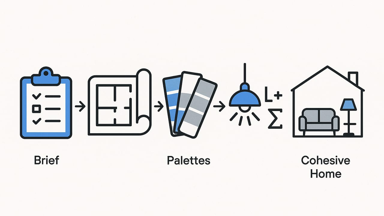
Great interior design looks effortless, but behind every serene living room or hardworking kitchen lies a system: a clear brief, measurable constraints, a palette, a lighting plan, and a feedback loop. Whether you’re designing your own home or shaping a client’s project, a repeatable workflow turns taste into results you can trust. This guide distills a practical, data-informed approach you can apply to any style.
Start with a Strong Brief
Interior design succeeds when function and identity align. Begin by writing a one-page brief that defines the project’s needs, constraints, and character.
- People & routines: Who uses the space? Ages, accessibility needs, pets, allergies, hobbies, work-from-home patterns.
- Activities & zones: Entertaining, gaming, cooking, focused work, stretching, sleep hygiene, storage.
- Constraints: Budget bands, time frame, landlord restrictions, structural limits, power/data locations.
- Assets worth keeping: Heirloom pieces, appliances, art, architectural features, natural light.
- Identity & mood: Three adjectives, two reference images, one color you love, one you avoid.
Convert this brief into specs you can measure: dimensions, clearances, light levels, materials that match cleaning habits, and a palette in defined lightness values.
Turn the Brief into Measurable Constraints
Essential Dimensions and Clearances
Codes vary by region; the ranges below reflect common, comfortable targets. Adjust to your context and users’ needs.
| Scenario | Minimum | Comfortable | Notes |
|---|---|---|---|
| Primary walkway | 32 in / 810 mm | 36–42 in / 915–1065 mm | Allow more near doors or where two people pass. |
| Sofa to coffee table | 14 in / 355 mm | 16–18 in / 405–455 mm | Reach without leaning; keeps knees clear. |
| TV viewing distance | 1.2 × screen diagonal | 1.5–2.5 × screen diagonal | Adjust for 4K vs HD and viewer acuity. |
| Dining chair behind table | 30 in / 760 mm | 36–44 in / 915–1120 mm | From table edge to wall/obstacle. |
| Bed sides clearance | 22 in / 560 mm | 28–36 in / 710–915 mm | Ensure access and linen change space. |
| Desk depth | 24 in / 610 mm | 28–30 in / 710–760 mm | Deeper helps with monitor viewing distance. |
| Kitchen work aisle | 36 in / 915 mm | 42–48 in / 1065–1220 mm | Wider if two cooks or island seating. |
Proportions and Visual Rhythm
- 60–30–10 rule: 60% dominant backdrop (walls, large rugs), 30% secondary (sofa, cabinetry), 10% accents (art, cushions). Apply to both color and texture.
- Golden-ish ratios: Avoid perfect halves. Try 5:3 or 3:2 relationships in paneling, tile patterns, and art groupings.
- Negative space: Plan intentional emptiness around focal points to let them breathe.
Palette and Materials That Behave Well
Color choice is not just taste—light reflectance affects brightness, perceived size, and energy use. Track LRV (Light Reflectance Value) for paints and large surfaces.
| LRV Range | Effect | Where It Shines | Notes |
|---|---|---|---|
| 80–95 | Very bright, bounces light | Low-light rooms, ceilings | Beware glare; soften with texture/matte sheens. |
| 60–79 | Balanced brightness | Most walls, neutral backdrops | Flexible with warm/cool lighting. |
| 30–59 | Cozy, grounded | Feature walls, cabinetry | May require higher task lighting. |
| 10–29 | Dramatic, enveloping | Media rooms, intimate dining | Amplify with layered lights and low-gloss finishes. |
Undertones matter. Pair warm whites (red/yellow undertones) with warm woods and brass; cool whites (blue/green) with concrete, chrome, or blue textiles. Unify materials by repeating a core triad: one wood tone, one metal, one stone/fabric that appear in at least three places each.
A Lighting Plan That Supports the Layout
Layer ambient, task, and accent light to match activities and mood. Set targets in lux (lumens per square meter).
- Living/Family rooms: 100–300 lux ambient; 300–500 lux for reading task zones.
- Kitchens: 300–500 lux ambient; 500–1000 lux on counters (under-cabinet lights are key).
- Bedrooms: 50–150 lux ambient; 150–300 lux at bedside/task.
- Workstations: 300–750 lux on the desk surface; minimize glare and reflections.
Estimate fixtures using lumen math:
// Quick lumen estimate
// area_m2 = room length × width
// target_lux = desired lux level (e.g., 200 for living ambient)
// depreciation = 1.2–1.4 (accounts for shade losses, aging)

function lumensNeeded(area_m2, target_lux, depreciation = 1.25) {
  return Math.round(area_m2 * target_lux * depreciation);
}

// Example: 18 m² living room at 200 lux
// lumensNeeded(18, 200) ≈ 4500 lumens total
Distribute those lumens across sources (ceiling, wall washers, floor lamps) to avoid glare and shadows. Use 2700–3000K for cozy residential spaces, 3500–4000K where crisp task work dominates, and keep CRI ≥ 90 to render colors accurately.
Layout Workflow That Scales
- Map adjacencies: Write pairs that must be near each other (kitchen–dining, entry–closet, desk–window) and those that should be separated (nursery–loud media).
- Zone first, then place furniture: Define quiet, active, and service zones using rugs, lighting groups, and storage spines.
- Plan circulation loops: Ensure a continuous route around large items. Avoid dead-ends that force people through task zones.
- Right-size anchor pieces: Scale the sofa, bed, and table to the room’s free area (room minus clearances). A good starting point is allocating 55–65% of free wall length to the main seating element.
- Think in sections, not just plans: Vary heights—low seating + mid bookcases + tall plants/pendants—to create rhythm and avoid a flat horizon line.
- Cable and power plan: Mark outlets for floor lamps, cordless vac docks, and charging drawers before finalizing casework.
Visual Hierarchy and Focal Points
- One hero per view: From each doorway or sofa, choose a single focal point (art, fireplace, view) and reduce competition nearby.
- Contrast controls attention: Place high-contrast elements at the focal point; keep periphery lower contrast and lower detail.
- Repeat to unify: Echo a shape (arc, slat, grid) at three scales: small (handles), medium (chair backs), large (lighting or paneling).
Style Without Labels: Five Variables to Tune
Forget style names for a moment. Decide where you sit on these five spectrums, then select pieces accordingly.
| Variable | Calm Contemporary | Classic Tailored | Industrial Loft |
|---|---|---|---|
| Hue temperature | Neutral-warm (beige, camel) | Warm (ivory, oxblood accents) | Cool-neutral (charcoal, steel) |
| Contrast level | Low to medium | Medium to high | High |
| Texture mix | Soft textiles, matte walls | Polished woods, fine wovens | Concrete, brick, raw metals |
| Line geometry | Clean, rounded edges | Symmetry, framed details | Exposed structure, grids |
| Ornamentation | Minimal | Molding, trim, tufting | Hardware, rivets, visible welds |
Pick one column as your base, then borrow one variable from another for depth—e.g., Calm Contemporary with a single polished classic piece.
Sustainable and Durable Choices
- Seating fabrics: Look for Martindale abrasion ≥ 30,000 cycles (busy households), pilling grade 4–5, and removable covers for maintenance.
- Hard floors: Choose finishes with repairability. Wood with a thick wear layer can be sanded; linoleum and cork can be spot-repaired; stone needs sealing but ages gracefully.
- Low-VOC finishes: Prioritize indoor air quality—especially in bedrooms and nurseries.
- Modular components: Break large storage into repeatable modules; replace parts, not whole systems.
- Lighting efficiency: LED with high efficacy (≥ 90 lm/W) and good drivers to avoid flicker; sensors in closets and pantries curb waste.
Common Interior Design Mistakes and Quick Fixes
- Rug too small: Front legs of major seating should sit on the rug; aim to cover at least 60–70% of the conversation area.
- One overhead light only: Add table/floor lamps and wall washers to balance brightness and reduce shadows.
- Art hung too high: Center at 57–60 inches (145–152 cm) from floor for most walls; align across groupings.
- Ignoring sightlines: Keep tall items off major sight axes; place the focal piece directly opposite entries.
- Overstuffed rooms: Remove one furniture piece and add vertical storage; negative space is part of the design.
- Monotone texture: If the palette is quiet, introduce varied textures (bouclé, ribbed glass, woven grasses) for depth.
- Glare at screens: Position lights beside or behind viewers, add diffusers, and choose matte finishes on nearby surfaces.
- Floating cables: Plan cord routes and add grommets, floor outlets, or cable channels before final placement.
A 30-Minute Validation Checklist
- Scale check: Compare furniture sizes to room measurements; confirm clearances from the table above.
- Lumen tally: Use the quick function to ensure each zone meets target lux; note dimmer needs.
- Palette proof: Gather samples and check them under the actual lighting (day and night). Verify undertones.
- Acoustics: Add soft surfaces if reverberation is high (rugs, curtains, books). Aim for a balanced mix in open-plan spaces.
- Thermal comfort: Shade west windows, add sheer layers for glare, and ensure vents aren’t blocked by furniture.
- Storage reality: Inventory items per zone and assign a specific home for each; add 10–15% buffer capacity.
- Photo test: Take phone photos from key vantage points. If the focal point isn’t clear in a snapshot, edit the composition.
Bringing It Together
Interior design is a craft of constraints: measure, choose, and iterate. Start with the brief, size the room by function, set a palette with light in mind, layer illumination to match tasks, and validate with a fast loop. The result is a home that feels intentional and lives well—whatever your style vocabulary.
If you prefer to sanity-check layouts in three dimensions, tools that turn a floor plan into a quick 3D model can shorten the feedback loop. For example, Floor Plan to 3D lets you upload a simple 2D plan and preview a proportional 3D space with accurate sizing, which is handy for visualizing furniture clearances, sightlines, and lighting before you commit.
