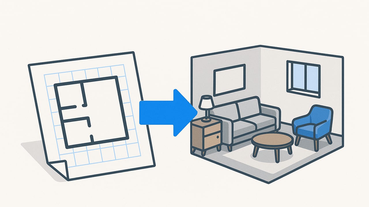
An interior design mockup is more than a pretty picture—it’s a decision-making tool that helps clients and teams see, test, and refine ideas before construction or purchasing. In this guide, you’ll learn a practical, end-to-end workflow to create an accurate interior design mockup, whether you start with a napkin sketch, a 2D floor plan, or a scanned PDF. We’ll cover scale, materials, lighting, QA, export settings, and common pitfalls so your visuals are both beautiful and buildable.
What Is an Interior Design Mockup?
An interior design mockup is a visual model—2D or 3D—that represents an intended layout, finishes, and furnishings for a space. It sits between a mood board and a construction drawing, combining inspiration with dimensionally accurate geometry.
- Mockup vs. Render: A mockup emphasizes design intent and options; a render is often the polished, final image. Many teams iterate mockups quickly, then finalize a photoreal render for sign-off.
- Mockup vs. Prototype: In interiors, a prototype is a physical sample (e.g., full-scale furniture mock-up or material board), while a mockup is digital or 2D.
- Use cases: Client presentations, option comparisons, circulation checks, color and finish evaluation, and marketing previews.
Choose the Right Mockup Method
Your method depends on timeline, accuracy needs, and deliverables. Here’s a quick comparison:
| Method | Best For | Outputs | Pros | Cons |
|---|---|---|---|---|
| Sketch (paper/tablet) | Early ideation | JPG/PNG | Fast, flexible, low friction | Not to scale; hard to iterate consistently |
| 2D vector/layout (Figma, Illustrator) | Flat plans, elevations, mood comps | SVG, PDF, PNG | Clean diagrams, easy annotations | Limited depth realism |
| 3D modeling (SketchUp, Blender) | Accurate layouts and photoreal renders | OBJ/FBX/GLTF, PNG/TIFF | Highly realistic, reusable assets | Learning curve; more setup |
| BIM/CAD (Revit, Archicad) | Construction-aligned design | DWG/RVT, IFC | Parametric, documentation-ready | Heavier workflow for simple mockups |
| Mobile + AI plan-to-3D | Rapid 3D from 2D floor plans | High-res images, GLB/GLTF (varies) | Fast, preserves dimensions | Feature set varies by app |
A Practical Workflow for an Interior Design Mockup
- Define scope and constraints: Room type, target budget, must-keep items, and functional goals (e.g., “seat 6”, “acoustic privacy”, “ADA clearance”).
- Gather inputs: Existing floor plan (DWG, PDF, or scan), measurements, ceiling heights, window/door sizes, photos of site, inspiration images.
- Establish scale: Set units (mm/inches), confirm plan scale, and create a base grid. Import your plan as a background and scale it correctly.
- Block the layout: Place walls, doors, windows; block furniture with simple volumes at correct footprints before detailing.
- Apply materials: Use PBR textures for consistent realism and manageable tweaks.
- Light the scene: Start with natural light, then add key interior luminaires matching color temperature and intensity.
- Set cameras: Build 3–5 consistent viewpoints (wide, detail, eye-level), and lock them for iteration.
- Iterate options: Vary finishes, layouts, and lighting. Save each option clearly.
- QA and measure: Verify clearances, dimensions, and alignment; ensure the mockup matches real-world constraints.
- Export and present: Prepare web and print versions; include dimensions and notes for clarity.
How to Get Scale Right (Without Guesswork)
Accurate scale is the backbone of a trustworthy interior design mockup. Use these steps:
- From printed plans: Identify the scale (e.g., 1/4″ = 1′). If a wall measures 2 inches on paper, real length is 2 × 4 = 8 feet.
- From a PDF: Use a known dimension (e.g., 3000 mm). Scale the PDF until the measured on-screen distance matches 3000 mm in your modeling environment.
- From a scan/photo: Rectify perspective first. Then align a reference edge to a known length and scale uniformly.
Rule of thumb: Keep tolerances within ±5 mm for interior objects and ±25 mm for overall room dimensions when modeling.
Materials: A Quick PBR Setup
PBR (Physically Based Rendering) materials produce consistent results across engines. Use these common maps:
- Base Color/Albedo: The color without shading.
- Roughness: 0 = mirror; 1 = matte. Most woods ~0.4–0.6.
- Normal/Bump: Surface detail without extra geometry.
- Ambient Occlusion (AO): Soft shadow detail, mixed subtly.
- Metalness: 0 for dielectrics (wood, fabric); 1 for metals.
Scale wood grain to match plank sizes (e.g., 180 mm width), align tile grout lines, and avoid repeating patterns by rotating or randomizing UVs on adjacent objects.
Lighting Setups That Sell the Space
- Daylight: Use an HDRI sky or sun/sky system. Rotate the sun to match facade orientation for believable shadows.
- Evening interior: Mix ambient (recessed) and accent (pendants, lamps). Use realistic color temperatures: 2700K warm residential, 3000K warm neutral, 4000K office.
- Retail/feature: Add directional spots with higher contrast; watch for glare and blowouts on glossy surfaces.
Enable global illumination for natural bounce light. If render times spike, increase samples moderately and use denoising sparingly to keep detail.
“Measure twice, model once. If it’s not dimensioned, it’s a guess.”
QA Checklist for a Reliable Interior Design Mockup
- Scale & units: Confirm a known dimension in the scene (e.g., a 900 mm door).
- Ergonomics: Verify clearances: 900 mm main circulation, 600 mm minimum around dining table edges, 1100 mm work aisle in kitchens.
- Heights: Countertops 900 mm (typical), vanity 850–890 mm, dining table 740–745 mm, pendant lights 700–800 mm above table.
- Doors & windows: Swing directions correct; sill heights consistent; window mullions align with cabinetry where intended.
- Materials: Wood grain direction logical; tile edges aligned; texture scale realistic.
- Lighting: No light leaks through ceilings; shadows soft and consistent; correct color temperature.
- Clash detection: Open all doors in the model and check collisions with furniture or each other.
- Annotations: Dimensions and callouts readable; avoid clutter.
Exporting and Sharing: Specs That Just Work
Match your output to the channel. Use this quick reference:
| Use | Format | Resolution/Scale | Color Space | Notes |
|---|---|---|---|---|
| Web/email | JPG (90%) or PNG | 1920–3000 px wide | sRGB | Add alt text and concise captions |
| Print boards | TIFF/PNG/PDF | 300 DPI at final size | CMYK (convert carefully) | Soft-proof to avoid dull reds/blues |
| CAD handoff | DWG/PDF | 1:1 model space, scaled viewports | n/a | Line weights and layers organized |
| AR/real-time | GLTF/GLB/USDZ | 2K textures (max), 50–200K tris/asset | sRGB | Compress textures; pivot at floor |
Common Pitfalls (and Fast Fixes)
- Off-scale imports: Use a known dimension to rescale the entire scene; lock units to avoid mixed mm/in setups.
- Skewed plan images: Perspective-correct the scan/photo before tracing or modeling.
- Moiré on fabrics and tiles: Increase texture resolution, add slight blur or adjust pattern scale; avoid tiny repetitive textures.
- Noisy renders: Increase samples, clamp indirect light, use denoising at 0.3–0.5 strength; reduce glossy roughness noise with better light paths.
- Flat lighting: Add contrast with a key light and controlled fill; introduce a warm/cool temperature contrast.
- Light leaks: Check surface normals and ensure walls/ceilings have thickness; disable shadow casting for fixtures only when necessary.
- Floating furniture: Snap Z positions to finished floor; add contact shadows with AO or area lights.
Speed Tactics: Work Smarter, Not Harder
- Asset libraries: Build a curated kit of dimensionally accurate furniture, appliances, and decor you actually specify.
- Parametric blocks: Use dynamic components (e.g., a cabinet that scales in 50 mm increments with automatic handles and toe kicks).
- Naming convention: Consistent names make replacements and batch edits easy.
project_kensington_living_room/
  scenes/
    cam_wide_01.json
    cam_detail_02.json
  assets/
    furniture/sofa_modern_2.1m.glb
    furniture/armchair_compact_0.8m.glb
    lighting/pendant_3000k_3x.glb
  materials/wood_oak_plank_2k/
    albedo.jpg
    normal.jpg
    roughness.jpg
    ao.jpg
  exports/
    web/option_a_1920.jpg
    print/option_b_300dpi.tif
Two Example Scenarios
1) Studio Apartment Refresh
Goal: Improve living/sleeping separation and add storage without crowding.
- Trace the existing plan and verify key dimensions: bed niche, window width, kitchen run.
- Block a sofa with a low shelf behind as a divider; add a ceiling track curtain for sleeping privacy.
- Use light-toned wood floor material and a medium-neutral wall paint to reflect daylight.
- Set a camera from entry and another from the bed area; ensure each tells the circulation story.
- Render Option A (open shelf divider) vs. Option B (glass screen) with identical cameras for apples-to-apples comparison.
QA focus: 900 mm pathways; curtain track clear of lighting; bed access on both sides if possible.
2) Compact Home Office
Goal: Fit a sit-stand desk, storage, and acoustic treatment in a 2.2 m × 2.6 m room.
- Place the desk under the window for daylight but add a screen shade in the mockup to control glare.
- Add wall-mounted storage to preserve floor space; model panel acoustics at first reflection points.
- Lighting: 4000K overhead panel + 3000K task lamp for comfort and visual hierarchy.
- Materials: matte paint to reduce specular highlights on video calls; wood desk with visible grain for warmth.
- Export an axonometric mockup with annotations, plus a photoreal eye-level render for client buy-in.
QA focus: Chair pull-out depth (900 mm), cable management path, door swing clearance.
Measure Success Beyond “Looks Nice”
- Decision speed: Track time from first mockup to client approval; aim for two option rounds or fewer.
- Revision count: Fewer, more meaningful revisions indicate clear visual communication.
- Clash detections: Note collisions caught in mockups vs. onsite—each is a cost/time save.
- Consistency: Are dimensions and standards applied uniformly across all views?
- Stakeholder comprehension: Use short surveys to confirm clients understood layout, scale, and finishes.
Pro Tips for Presentation
- Tell a story: Order images to reflect entry, main space, then detail moments.
- Use consistent lens and height: 24–28 mm equivalent, camera at 1.5 m eye level for interiors.
- Annotate selectively: Dimension only critical elements; keep visuals clean.
- Offer a comparison grid: Put Options A/B/C on one sheet with the same camera angles.
- Archive sources: Save textures, HDRIs, and asset versions used; it accelerates revisions months later.
If your starting point is a black-and-white floor plan and you need a rapid, dimensionally faithful interior design mockup, the iOS app Floor Plan to 3D can convert 2D layouts into detailed 3D renders and export high-resolution images suitable for proposals and presentations.
