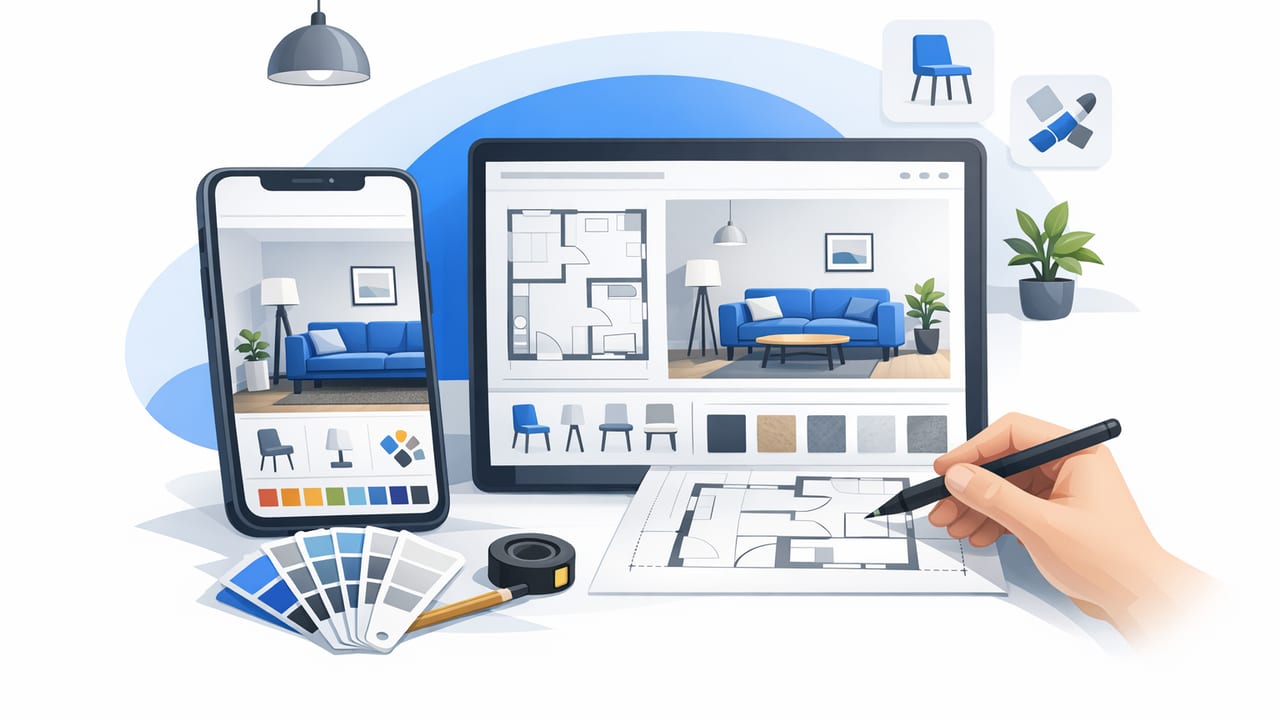
An interior design app can be more than a mood-board tool. The best ones help you verify layout decisions—clearances, furniture fit, sightlines, and even renovation “what-ifs”—before you spend money. The difference between a fun concept and a decision-ready preview is workflow: starting with accurate inputs, testing multiple options quickly, and validating the result with simple checks.
This guide walks through a practical, accuracy-first process for using an interior design app to move from a floor plan or sketch to clean 3D renders, smarter layouts with an AI room planner, and shareable previews for contractors, clients, or family members.
What a good interior design app should help you decide
If your app can’t support decisions, it’s just visualization. Aim for tools and features that answer questions like:
- Will it fit? Sofa depth, dining clearances, door swings, circulation paths.
- Will it feel right? Proportions, focal points, daylight direction, ceiling height cues.
- What changes the budget? Moving plumbing, removing walls, changing window/door sizes.
- What’s the fastest improvement? Layout swaps, storage placement, lighting layers, exterior refresh options.
Core features to look for (and why they matter)
Not every interior design app is built for floor-plan-driven work. Use the table below as a quick evaluator.
| Feature | Why it matters | What to look for |
|---|---|---|
| Floor plan conversion | Fastest path from “idea” to accurate layout | Imports scans/photos, cleans lines, detects rooms/walls |
| Dimension support | Prevents scale drift and furniture that “looks right” but doesn’t fit | Editable measurements, snapping, wall thickness control |
| 3D renders | Helps evaluate volume, sightlines, and lighting assumptions | Multiple camera angles, realistic materials, decent shadows |
| AI room planner | Speeds up layout options and style exploration | Constraints-based suggestions (room size, function, existing items) |
| Library + custom objects | Real-world sizing is the difference between “pretty” and “possible” | Size editing, categories for storage, appliances, fixtures |
| Export/share | Makes the output useful in planning and approvals | High-res images, PDFs, links, and consistent scale notes |
| Exterior options | Enables curb-appeal tests without separate software | Siding/colors, trim, landscaping placeholders, before/after views |
Accuracy-first workflow: from plan to decision-ready 3D
Use this process whether you’re redesigning one room or mapping an entire renovation. The goal: lock the layout first, then style it.
1) Start with the best input you can get
Your render is only as reliable as the source plan. Aim for one of these (best to worst):
- Measured floor plan (with at least one known dimension per room)
- Blueprint/floor plan scan (clear labels, straight photo, high contrast)
- Hand sketch (only if you can add measurements)
Tip: If you’re photographing a paper plan, keep the camera parallel to the page and include a known measurement (like a labeled wall length). Skewed photos are a common cause of “mystery scaling.”
2) Confirm scale with one “anchor” measurement
Even if an app auto-detects dimensions, verify scale using one anchor measurement you trust (for example, a 10 ft wall). Then check a second measurement in another direction to catch stretch/distortion.
Rule of thumb: If two known measurements don’t match after scaling, fix the input (re-scan, re-square, or manually set dimensions) before you place furniture.
If you like to sanity-check with quick math, here’s a small snippet to compute a pixels-to-feet scale when you have one known wall length. (You’ll still need a way to read pixel distance in your image tool.)
# Pseudocode / Python-like
known_length_ft = 10.0
measured_pixels = 842  # pixel distance between the wall endpoints
ft_per_pixel = known_length_ft / measured_pixels

# Convert another pixel measurement to feet
other_pixels = 315
other_length_ft = other_pixels * ft_per_pixel
print(other_length_ft)
3) Build the envelope first: walls, openings, fixed elements
Before décor, model what you can’t easily change:
- Walls and thickness (especially around bathrooms/kitchens)
- Doors and swings (collision issues show up fast in 3D)
- Windows (light direction affects material choices later)
- Stairs, columns, fireplaces (anything that controls circulation)
When using floor plan conversion, verify that labels and room boundaries didn’t get merged or split incorrectly—common with low-resolution scans or faint lines.
4) Place “clearance zones” before furniture
Clearances are the silent failure mode of many designs: everything looks perfect until a door can’t open or a walkway is too tight. In your interior design app, temporarily represent clearance zones as simple rectangles or “buffer” objects.
- Main walkways: keep them consistently passable from entry to key destinations
- Dining: allow pull-out space behind chairs
- Kitchens: ensure appliance doors and work zones don’t overlap badly
- Bathrooms: door swings + fixture spacing matter more than style
5) Use the AI room planner for options—then constrain it
An AI room planner is best used as an idea generator, not an authority. The trick is to feed it constraints so suggestions stay realistic.
Try prompts structured like:
- Function: “Living room for lounging + reading corner + toy storage.”
- Must-keep items: “Keep 84-inch sofa and 60-inch TV.”
- Path constraints: “Maintain clear path from hallway to balcony door.”
- Style constraints: “Warm minimal, oak + off-white, black accents.”
Generate 3–5 options quickly, then choose one to refine. The winning layout is often a hybrid: take circulation from option A, storage from option B, and focal wall from option C.
6) Switch to 3D early—and rotate through real viewpoints
Don’t wait until the end to open the 3D view. Use it as a diagnostic tool:
- Entry view: what do you see first?
- Seated eye level: does the TV/fireplace height feel comfortable?
- Kitchen work view: are counters usable, is lighting blocked?
- Window view: do tall items block light or feel bulky?
Tip: Save camera angles as “checkpoints.” When you test new layouts or finishes, compare the same viewpoints to avoid being fooled by a flattering angle.
7) Add materials and lighting in a controlled way
Materials are where many users lose time. Keep it systematic:
- Choose one neutral base (walls + large rug/floor) first.
- Add one wood tone (casework, shelves, table) and keep it consistent.
- Limit accents to 1–2 metals (e.g., black + brass).
- Test lighting in layers: ambient (ceiling), task (work areas), accent (art/wall wash).
Render a small set of variations (e.g., three wall colors) instead of endlessly tweaking. Decision speed comes from comparison, not perfection.
Practical mini-example: fixing a “looks fine” layout that doesn’t work
Imagine a narrow living/dining room. In 2D, a sectional and a 6-seat dining table may appear to fit. In 3D, you notice:
- The sectional blocks the natural walking path from the entry to the patio door.
- Dining chairs hit the wall when pulled out.
- The TV wall feels cramped because the viewing distance is shorter than expected.
A fast correction workflow inside an interior design app:
- Replace the sectional with a standard sofa + two chairs to open the path.
- Rotate the dining table or switch to an extendable style.
- Move storage vertical (tall cabinet/shelves) instead of deeper furniture.
- Re-render the same two camera angles to confirm the improvement.
Renovation previews: how to test changes without overcommitting
When you’re previewing renovation ideas (not just furniture), keep each test isolated so you can attribute the result:
- Layout test: remove a wall or widen an opening, keep finishes constant.
- Finish test: change cabinets/counters, keep layout constant.
- Lighting test: add recessed/task lighting, keep finishes constant.
This “one variable at a time” approach helps you avoid choosing a layout because you liked the paint color in that version.
Exterior refresh previews (quick wins that pair well with interior planning)
If your interior design app supports exterior concepts, you can explore curb appeal in the same decision framework:
- Test siding + trim contrast in 2–3 options (light, mid, dark).
- Swap the front door color for a single bold accent.
- Use simple landscaping blocks to judge scale (shrubs/trees often get oversized).
- Compare before/after using the same viewpoint and lighting condition.
Pre-flight checklist before you share or export
Before exporting images for a proposal, contractor conversation, or family decision, run this quick list:
- Scale verified with at least two known dimensions
- Door swings checked for collisions
- Walkways continuous from entry to main destinations
- Appliance/fixture clearances not overlapping
- Ceiling height assumption stated (especially for tall cabinetry)
- Two to four key views captured (not 20 random angles)
- Notes added for anything “conceptual” (e.g., custom built-ins)
Common pitfalls (and how to avoid them)
- Relying on auto-detected walls: always confirm wall thickness and openings.
- Designing from one camera angle: save consistent viewpoints and compare.
- Oversized décor objects: resize to real dimensions; don’t trust default assets.
- Confusing style with layout: lock circulation and clearances before finishes.
- Exporting without context: include a simple 2D plan view alongside 3D renders.
Putting it all together
The most effective way to use an interior design app is to treat it like a lightweight planning environment: verify geometry, test multiple layouts, then render a small set of comparisons you can confidently share. When you follow an accuracy-first workflow, you’ll spend less time second-guessing and more time making decisions that hold up in the real room.
If you’re looking for an iOS tool that combines floor plan conversion, AI-guided room planning, and exportable 3D renders in one place, Floor Plan to 3D & Home Redesign is one option to explore.
