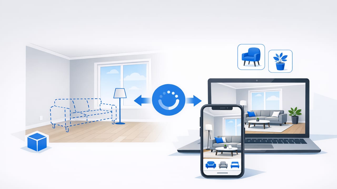
Empty spaces can be surprisingly hard to “read.” Buyers struggle to judge scale, renters can’t picture daily life, and remodel clients can’t tell whether a layout will feel open or cramped. That’s why an empty room staging app has become a practical tool for real estate teams, designers, and homeowners: it turns blank rooms into clear, furnished visuals without the logistics of physical staging.
This guide walks through a repeatable workflow for creating realistic staged images—starting from a floor plan, moving into accurate 3D, and finishing with presentation-ready renders. The focus is on realism (proportions, circulation, lighting) rather than “pretty but impossible” concepts.
What “empty room staging” really means (and what it should achieve)
Empty room staging is the process of adding furniture, decor, and lighting cues to a space that’s unfurnished—either in reality (physical staging) or digitally (virtual staging). A good digital staging result should:
- Clarify scale: show how a queen bed, sofa, or dining table actually fits.
- Demonstrate function: highlight use-cases (work-from-home corner, reading nook, kids’ play zone).
- Support decision-making: help viewers choose between layouts, not just finishes.
- Stay believable: match perspective, proportions, and typical furniture sizes.
“Staging is not decoration—it’s communication.” The goal is to help someone understand how the space works.
When an empty room staging app is the best choice
Digital staging isn’t only for listings. It’s also useful for early design and renovation planning where quick iteration matters. Common scenarios include:
- Real estate listings: present multiple styles for the same room (modern, coastal, traditional).
- New builds and pre-sales: stage from floor plans before construction is complete.
- Renovation previews: test furniture placement after removing a wall or resizing a room.
- Short-term rentals: define sleeping capacity and living zones clearly.
- Empty-room marketing: create a consistent “look” across a portfolio.
Virtual staging vs physical staging: a practical comparison
Physical staging can be powerful, but it’s time-consuming and hard to scale. Virtual staging can be faster and more flexible—especially when you need multiple layouts or design directions.
| Factor | Physical staging | Virtual staging (3D / app-based) |
|---|---|---|
| Turnaround | Days to weeks (delivery, setup) | Hours to days (iterations are fast) |
| Iterations | Limited (labor + logistics) | High (swap styles, layouts, finishes) |
| Best for | In-person showings | Online listings, proposals, early planning |
| Accuracy risk | Low if furniture fits on-site | Depends on correct room dimensions + scaling |
| Consistency across properties | Hard (inventory varies) | Easier (repeatable style sets) |
The realism checklist: what makes staging look “right”
Before the step-by-step workflow, here’s a short checklist that separates convincing staging from images that feel off.
1) Correct scale and clearance
Viewers intuitively sense when circulation is unrealistic. Keep clearances believable:
- Walkways: 30–36 in where possible
- Dining chair pull-back: 24–30 in
- Bed sides: aim for 24 in+ on at least one side
- Sofa-to-coffee-table: 14–18 in
2) A focal point and a purpose
Every staged room should answer: “What is this room for?” and “Where do you look first?” (fireplace, feature wall, view, media wall).
3) Lighting that matches the story
If you stage a cozy reading corner, use warm lamps. If you stage a bright kitchen, emphasize daylight and clean task lighting. Lighting is often the fastest way to move from “CG-looking” to “livable.”
Step-by-step workflow: from floor plan to staged 3D images
This workflow assumes you have either a floor plan/blueprint image or basic measurements. The key is to anchor staging to the layout so everything stays proportionate.
Step 1: Start with a clean, readable plan
If your plan is scanned, make it easy for a conversion tool to interpret:
- Use a high-contrast black-and-white image where possible.
- Crop out title blocks and notes that aren’t needed.
- Ensure dimensions and labels are visible (rooms, doors, windows).
- Check that the plan is not skewed; rotate to straight.
Step 2: Convert the floor plan to a 3D room shell
Accurate staging depends on accurate geometry. When converting, confirm:
- Wall thickness looks plausible (not paper-thin).
- Door swings and openings match the plan.
- Window placement is correct (height + location affect lighting).
- Ceiling height is set (a common realism breaker).
Tip: If your renders feel “off,” it’s often a ceiling-height mismatch. A room modeled at 10 ft will make typical furniture feel undersized compared to an 8 ft ceiling.
Step 3: Choose a staging goal (don’t skip this)
Open-ended staging leads to clutter. Pick one goal per image:
- Show seating capacity (e.g., sofa + two chairs)
- Show work-from-home functionality (desk + storage)
- Show sleeping capacity (bed sizes, nightstands)
- Show flow between kitchen/dining/living
Step 4: Place “anchor” furniture first
In an empty room staging app, it’s tempting to decorate immediately. Instead, place big items first:
- Rugs (they define zones and scale).
- Sofa/sectional or bed (largest functional piece).
- Dining table (sets circulation constraints).
- Storage pieces (media console, dresser, buffet).
Once anchors are correct, add secondary items (chairs, side tables) and then decor (art, plants). This order keeps the space realistic and walkable.
Step 5: Use AI room planning to test layout options quickly
AI-guided room planning is most valuable when you treat it like a layout generator, not a final answer. A strong approach is to create 3 layout variants:
- Variant A: maximize seating
- Variant B: maximize openness / circulation
- Variant C: add a functional zone (desk, reading nook)
Then, compare which variant best supports the listing narrative or renovation objective.
Step 6: Apply materials and lighting with restraint
To avoid “plastic” renders:
- Keep wood tones consistent (limit to 1–2 species per room).
- Use matte finishes for walls; reserve gloss for small accents.
- Add layered light: daylight + ceiling + lamps (even if subtle).
- Don’t over-saturate. Neutral colors photograph better and feel larger.
Step 7: Render angles that answer real questions
Choose camera views that help someone decide, not just admire:
- Corner-to-corner view to show depth and furniture fit
- Entry view to show the first impression and circulation
- Functional close-up (desk area, dining zone) to clarify purpose
Common staging mistakes (and how to fix them fast)
- Furniture floating or clipping: ensure items sit on the floor plane; check wall alignment and scaling.
- Oversized rugs: rugs should typically leave 8–18 in of floor visible at room edges (depending on style).
- Too much decor: remove half the accessories; keep surfaces readable.
- Unrealistic seating layouts: avoid chairs that block doors, closets, or primary pathways.
- Mismatch with architecture: ultra-modern furniture in a traditional home can feel jarring—unless that contrast is intentional.
Mini playbook: staging recipes by room
Living room
- Anchor with a sofa facing a focal point (TV wall, fireplace, view).
- Add two secondary seats if space allows.
- Use a rug to define the conversation area.
Bedroom
- Choose the correct bed size (full/queen/king) for realism.
- Add two nightstands only if there’s clearance; otherwise one is fine.
- Keep decor minimal—bedrooms should feel calm and spacious.
Dining area (open plan)
- Pick table shape based on circulation (round often fits tight paths better).
- Show a realistic number of chairs (don’t force 8 seats into a 6-seat zone).
Home office nook
- Use a compact desk + task chair + one storage element.
- Light it like a real workspace (desk lamp or focused ceiling light).
Export and presentation tips for listings and proposals
Once you have a staged design, your output should match where it will be used:
- MLS / listing sites: prioritize wide angles, consistent brightness, and simple styling.
- Renovation proposals: include 2–3 variants and label them clearly (Option A/B/C).
- Client approvals: show a “before” empty shell view next to the staged view.
If you share multiple options, name files consistently so teams don’t mix versions:
projectname_room_view_option_resolution.jpg
MapleSt_LivingRoom_Corner_A_3000px.jpg
MapleSt_LivingRoom_Entry_B_3000px.jpg
Choosing the right empty room staging app: a short evaluation guide
Not all tools prioritize the same outcome. If your goal is believable staging anchored to real layout constraints, look for:
- Floor plan conversion that preserves dimensions and proportions
- Easy layout iteration (duplicate scenes, swap furniture sets)
- AI room planner features that suggest multiple arrangements
- High-resolution 3D renders suitable for marketing and presentations
- Control over lighting and materials so results don’t feel generic
Putting it all together
A strong staging workflow is less about adding more items and more about making the space understandable: correct scale, clear function, and believable lighting. When you start from a floor plan, convert it to a precise 3D shell, and then stage with realistic clearances, an empty room staging app can deliver visuals that help people make decisions faster—whether that’s choosing to tour a property, approving a remodel, or committing to a layout.
Gentle note: If you want an iOS workflow that combines floor plan to 3D conversion with AI-guided planning and exportable renders, you can explore Floor Plan to 3D & Home Redesign as one option among many.
