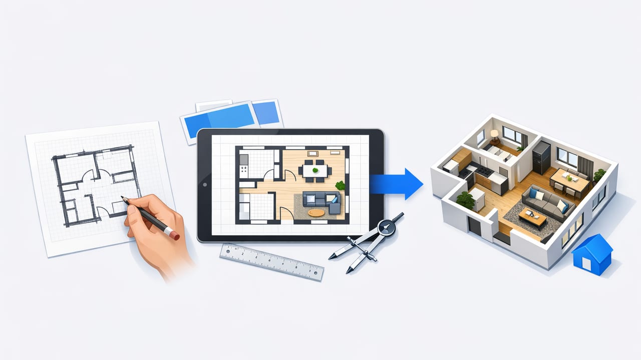
Floor plan rendering used to mean hiring a specialist to rebuild a layout in CAD, then waiting days for revisions. Today, AI-assisted tools can translate a scanned or photographed 2D plan into a usable 3D model in minutes—but only if you protect accuracy. The biggest risk isn’t “ugly visuals.” It’s making confident decisions from a model that’s subtly wrong: a door swing reversed, a wall thickness misread, or a scale assumption that shifts everything.
This guide is a practical, accuracy-first checklist for turning black-and-white 2D floor plans into reliable 3D output. It’s written for homeowners, real estate teams, and design professionals who need clear visuals for planning, approvals, and presentations—without losing the truth of the original layout.
What floor plan rendering actually includes
In everyday conversation, “rendering” can mean anything from a simple 3D view to a photoreal interior. For workflow clarity, it helps to separate three layers:
- Geometry: walls, openings, room boundaries, ceiling height, stairs.
- Semantics: what objects are (door vs. window), room labels, fixtures.
- Visual styling: materials, lighting, camera angle, shadows, and export quality.
Most mistakes in floor plan rendering come from the first two layers. Styling can be improved later, but incorrect geometry or misidentified openings can invalidate measurements and planning decisions.
When 3D is worth it (and when 2D is enough)
3D shines when you’re evaluating spatial relationships: sightlines, circulation, furniture fit, and how changes affect adjacent spaces. If your goal is simply to communicate dimensions to a contractor, a clean 2D plan might be sufficient.
| Goal | 2D Plan | 3D Floor Plan Rendering |
|---|---|---|
| Verify room sizes and overall footprint | Good | Good (if scale is validated) |
| Test furniture layouts and circulation | Okay | Best |
| Explain a renovation concept to non-experts | Often confusing | Much clearer |
| Create marketing visuals | Limited | Best (with styling) |
“Clarity beats realism.” A slightly simple 3D model that is dimension-true is more useful than a beautiful render built on incorrect assumptions.
Input quality: the fastest way to improve results
AI tools are sensitive to the quality of your source plan. Before you start any floor plan rendering workflow, take five minutes to improve the input.
Checklist for a clean 2D floor plan image
- Straighten the image: Rotate so walls are truly horizontal/vertical (or consistently angled).
- Increase contrast: Dark lines on a light background help segmentation (wall vs. text).
- Remove shadows and glare: Especially when photographing paper plans.
- Crop tightly: Include the full plan but avoid desk edges, hands, or surrounding notes if possible.
- Keep labels readable: Room names and dimension strings can help the model infer intent.
Tip: If you only have a photo, take it square-on. A small perspective skew can cause the AI to “stretch” one axis, which then cascades into incorrect room proportions.
The accuracy-first rendering workflow (step by step)
Use this workflow whether you’re converting a single room or a whole home. The goal is to establish scale, then validate geometry, then polish presentation.
1) Establish a known scale anchor
A 3D model is only as trustworthy as its scale. Ideally, your plan includes at least one confirmed dimension (for example, “12'–0"”). If not, measure one real-world distance: a doorway width, a room width, or the exterior wall length.
- Best anchors: overall exterior dimension strings, a clearly labeled room size, or a measured wall.
- Acceptable anchors: standard door width (only if you’re sure it’s standard in that building).
2) Confirm wall thickness and openings
AI can confuse thick lines, double lines, or hatch patterns. Before trusting the 3D output, verify:
- Exterior vs. interior walls: exterior walls are usually thicker; confirm the model matches.
- Door swings: ensure the hinge side and swing direction align with the plan.
- Window placement: check that windows aren’t shifted along the wall or interpreted as doors.
3) Validate room boundaries and names
Room labels are more than cosmetic. If an app recognizes “Kitchen,” it may auto-suggest typical fixtures or interpret partial walls differently. Make sure rooms are separated correctly and labels aren’t merged (for example, “BED” and “ROOM” becoming two rooms).
4) Add height assumptions explicitly (don’t guess silently)
Most 2D floor plans don’t include ceiling height. If your tool asks for it, choose a value you can defend, and document it in your notes. If you’re presenting to others, transparency prevents bad downstream decisions.
- Common defaults: 8 ft or 2.4 m, but verify if the building is older, vaulted, or a condo with drop ceilings.
- Stairs: if present, check the rise/run logic and whether the stair orientation matches the plan.
A practical QA checklist (catch 90% of errors fast)
After the first render, do a fast “walkthrough audit.” The goal is not perfection—it’s catching the errors that would change decisions.
10-minute audit
- Perimeter check: does the exterior footprint match the 2D plan?
- Three key measurements: verify at least three distances (e.g., living room width, hallway width, bedroom depth).
- Door count: number of doors should match; missing doors are common failure points.
- Window count: especially on exterior walls; confirm placement roughly matches.
- Connectivity: confirm there’s a path between rooms where one should exist (no “phantom walls”).
- Odd angles: bay windows and angled walls often get simplified—decide if that’s acceptable.
If any of these fail, fix geometry first. Styling and lighting changes won’t correct a misread wall.
Presentation: make your 3D render easy to understand
Once your geometry is sound, make deliberate choices that improve comprehension. For most stakeholders, the best floor plan rendering is the one that communicates layout quickly.
Choose the right view: dollhouse vs. cutaway vs. eye-level
- Dollhouse: best for whole-home understanding and adjacency.
- Top-down 3D / cutaway: best for furniture planning and circulation.
- Eye-level interior views: best for showing how a renovation will “feel,” but easiest to mislead if scale is wrong.
Materials: neutral beats trendy
Unless you’re selling a specific design aesthetic, keep materials neutral. Busy textures can hide edge alignment issues and distract from layout decisions.
- Use: light wood / neutral tile / matte white walls.
- Avoid (early): high-gloss surfaces, strong patterns, heavy contrast.
Lighting: aim for “diagram clarity”
Overly dramatic shadows can make rooms look smaller or distort corners. Use even lighting, moderate shadows, and consistent exposure across views. If you export multiple images, consistency reads as professionalism.
Exports and handoff: how to keep revisions organized
Floor plan rendering is rarely one-and-done. You’ll iterate: “move the sofa,” “swap the door,” “show Option B.” A small naming system prevents confusion when sharing with clients, family, or contractors.
Simple file naming convention
project_room-or-level_option_view_revision.ext

# Examples
maple-st_house_main_optA_dollhouse_r03.png
maple-st_house_kitchen_optB_eye_r01.jpg
If your tool supports metadata or notes, store the scale anchor used (for example, “Exterior wall = 38 ft 6 in”) and any assumptions (ceiling height, wall thickness).
Recommended export set (minimum)
- 1 dollhouse view for overall understanding
- 1 top-down cutaway with furniture for planning
- 2–4 interior views for key rooms (kitchen, living, primary bedroom)
- 1 annotated image noting assumptions (optional but helpful)
Common pitfalls in AI-assisted floor plan rendering (and fixes)
Pitfall: The model looks right, but scale is off
Symptom: furniture looks too big/small; hallways feel unnaturally wide.
Fix: re-apply a known measurement anchor; verify units (ft vs. m). Confirm that the source image wasn’t skewed by perspective.
Pitfall: Doors and windows get swapped
Symptom: sliding doors appear as windows; windows become openings to nowhere.
Fix: zoom in on the 2D plan to ensure symbols are crisp; remove overlapping text near openings; manually correct the opening type if supported.
Pitfall: Curved or angled walls are simplified
Symptom: bay windows become flat; angled corridors become rectangular.
Fix: decide whether the simplification affects decisions. If it does, prioritize tools/workflows that allow manual vertex edits or re-tracing.
How to choose success metrics (so “good” is measurable)
Before you present the render, define what “accurate enough” means for your use case. Here are practical targets:
- Concept planning: key room dimensions within ~2–3% and correct connectivity (doors/paths).
- Furniture fit decisions: key dimensions within ~1–2% and openings placed correctly along walls.
- Contractor pricing support: confirm with field measurements; treat the render as a visualization aid, not a legal drawing.
These targets keep you honest: the more consequential the decision, the more you should verify measurements in the real space.
Putting it all together
Great floor plan rendering is less about pushing a “make it 3D” button and more about controlling assumptions: scale, wall interpretation, openings, and heights. If you consistently (1) clean the input, (2) anchor scale, (3) run a fast QA audit, and (4) export a clear set of views, you’ll get 3D visuals that actually support confident decisions.
If you prefer doing this workflow on an iPhone or iPad, Floor Plan to 3D is one example of an iOS app designed to convert black-and-white 2D plans into dimension-aware 3D renders suitable for sharing and presentations.
