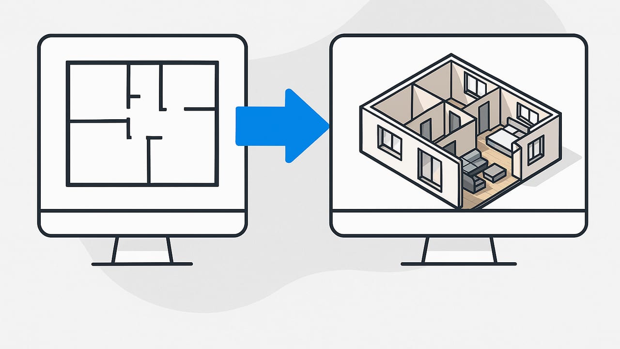
A floor plan render bridges the gap between technical drawings and human imagination. Converting a black-and-white plan into a dimensional, light-filled 3D image helps clients, teams, and stakeholders instantly grasp proportions, flow, and fit. Whether you’re a homeowner planning a remodel, a designer validating a layout, or a real estate pro marketing a listing, a clear and faithful floor plan render turns intent into understanding.
This guide walks through the end-to-end workflow: preparing your source plan, scaling accurately, building geometry, choosing lighting and materials, avoiding common mistakes, and exporting files that look sharp on web and print. You’ll find checklists, comparisons, and simple math that keeps your renders true to scale and persuasive in presentation.
What Is a Floor Plan Render?
A floor plan render is a 3D visualization created from a 2D plan. Unlike a flat drawing, it adds height, depth, materials, and lighting, letting viewers understand volume, adjacencies, circulation, and atmosphere. The right rendering style depends on audience and purpose. Below is a quick comparison.
| Render Style | Best For | Strengths | Watch Outs |
|---|---|---|---|
| Axonometric/Isometric | Concept approval, planning | Clear structure, readable layout, minimal distortion | Less emotional impact than photoreal |
| Photoreal | Marketing, client buy-in | High emotional appeal, realistic light & materials | Longer setup; risk of over-promising |
| Diagrammatic 3D | Technical reviews, quick iterations | Fast, clean, highlights measurements | Can feel sterile or less engaging |
Preparation: Start With the Right Inputs
Before you model a single wall, make the 2D source plan trustworthy. The fidelity of your floor plan render is only as good as the input.
- Source quality: Aim for a clean, high-contrast plan at 300 DPI or higher. Remove smudges, skew, and edge shadows.
- Scale and dimensions: Confirm the drawing scale (e.g., 1/4" = 1'-0"). If none is shown, rely on at least two known dimensions (room width, door, or window sizes).
- Wall thickness: Exterior walls often 6–8 in (150–200 mm); interior 3.5–5.5 in (90–140 mm). Document variations.
- Ceiling heights: Note floor-to-ceiling heights and any dropped ceilings, bulkheads, or beams.
- Openings: Doors, windows, and cased openings must have width, height, and sill/head heights.
- Mechanical and plumbing: Mark fixtures and clearances for kitchens, baths, and utility rooms.
Scaling a Scanned Plan: Simple Math
If your plan is an image without a stated scale, derive one from a known dimension.
- Pick a straight dimension on the plan (e.g., a 12 ft wall).
- Measure its length in pixels in your modeling tool.
- Compute scale factor = real length / pixel length.
// Example
// Measured: 12 ft wall = 864 px
// Convert 12 ft to inches: 144 in
// Scale factor = 144 in / 864 px = 0.1667 in/px
// Use this factor to scale the entire image so model units align.
Once scaled, verify with a second known dimension. If the second check is off by more than 1%, correct the image (deskew or rescale) and recheck.
Step-by-Step Workflow to a Convincing Floor Plan Render
1) Import and Trace
- Import: Bring the cleaned plan into your modeling software as a locked reference on its own layer.
- Set units: Choose metric or imperial and confirm snapping increments (e.g., 1 in or 25 mm).
- Trace walls: Use centerline or finish-to-finish methods consistently. For speed, trace outlines first, then offset for wall thickness.
2) Define Levels and Heights
- Story heights: Create levels (e.g., 0'-0", 9'-0").
- Open-to-below: Model voids accurately for mezzanines and double-height spaces.
- Ceilings: Add ceiling planes or slabs; they matter for bounce light and realism.
3) Doors, Windows, and Openings
- Place openings: Insert doors and windows by center or reference edge; set heights and swing directions.
- Trim and casings: Even simple profiles add scale cues and improve realism.
- Consistency: Use a door schedule to keep sizes uniform where intended.
4) Floors, Stairs, and Railings
- Floor slabs: Model per room or per level; include transitions for thresholds.
- Stairs: Calculate rise/run. Typical residential riser 7–7.5 in (175–190 mm); tread 10–11 in (250–280 mm).
- Railings: Add at code heights; they visually ground stairs in 3D.
5) Furniture and Fixtures
- Use scaled assets: Sofas, beds, tables, and fixtures must match standard sizes to communicate fit.
- Layout rules: Maintain walkways of 36 in (900 mm) where possible; 42–48 in (1050–1200 mm) for kitchens.
- Declutter: Add enough props to convey life, but avoid crowding the frame.
6) Materials and Textures
- PBR materials: Use physically based materials with correct scale (e.g., 6 in plank width) and real-world roughness/specular values.
- Color management: Work in a linear pipeline if available; enable tone mapping to avoid blown highlights.
- Material differentiation: Subtle contrasts between wall paint, trim, and ceiling improve depth perception.
7) Lighting: The Mood Maker
- Sun/sky system: Set geographic location, date, and time for natural light direction and believable shadows.
- HDRI environments: For even, photographic light, use a neutral HDRI; rotate to control key light direction.
- Interior fixtures: Add key luminaires (pendants, cans, sconces). Use realistic lumen values and color temperatures (2700–3000K warm residential).
- Shadow softness: Slightly softer shadows often feel more natural indoors.
8) Cameras and Composition
- Focal length: 24–35 mm equivalent works well for interior overviews; avoid extreme wide angles that distort scale.
- Eye level: 4.5–5 ft (1350–1500 mm) for natural perspective; for axonometric views, keep a consistent tilt/height.
- Rule of thirds: Position key features along thirds; avoid cutting through major furniture with the frame edge.
9) Rendering and Denoising
- Samples and bounces: Increase until noise is acceptable; use denoising sparingly to preserve texture detail.
- Global illumination: Ensure multiple light bounces for convincing indirect light, especially with white interiors.
10) Post-Production
- White balance: Neutralize color casts; target natural skin-tone balance.
- Exposure and contrast: Stay within a photographic range; avoid overly crushed blacks.
- Labels and callouts: Add subtle room labels or dimensions for planning-focused renders.
Rule of thumb: If your floor plan render looks great but fails basic clearance checks, it’s not ready. Accuracy first, polish second.
Accuracy and QA: Keep the Render Honest
Visual appeal matters, but renders must match reality. Build a quick QA routine into your process.
- Dimensional spot checks: Verify three dimensions per room (width, length, at least one diagonal or opening). Target < 1% deviation.
- Door swings and clearances: Ensure doors don’t collide with furniture and maintain 32–36 in (800–900 mm) passage clearances.
- Kitchen and bath standards: Check work triangle distances, appliance clearance, and fixture centerlines.
- Stairs: Confirm consistent risers; small variations read as errors in 3D and in reality.
- Window heights: Align sill and head heights across similar windows to avoid visual jitter.
- Ceiling conflicts: Audit beam, bulkhead, and cabinet heights for clashes.
Lighting and Material Tips That Sell the Space
Two renders can share geometry but feel worlds apart. Use these pointers to elevate your floor plan render:
- Material scale: A wood grain that’s too large breaks the illusion. Always match texture scale to real product data.
- Specularity control: Dial in roughness to avoid plastic-looking surfaces; most painted walls sit around 0.6–0.8 roughness.
- Edge softening: Micro bevels catch highlights and add realism, even at 1–2 mm.
- Layered light: Combine sun/sky with practical fixtures for depth. Turn off half the fixtures and compare; less can be more.
- Color temperature harmony: Balance warm interior lights with neutral daylight. Mixed color temps should be intentional, not accidental.
Common Mistakes (and Quick Fixes)
- Problem: Rooms feel cramped. Fix: Check furniture sizes and door clearances; reduce props and widen walkways.
- Problem: Flat-looking results. Fix: Add contrast with directional light, adjust tone mapping, and introduce material variance.
- Problem: Scale drift from scanned images. Fix: Calibrate with at least two known dimensions; correct skew before tracing.
- Problem: Noise and speckle. Fix: Increase samples, enable clamping for fireflies, or use a higher-quality HDRI.
- Problem: Overly wide camera. Fix: Step back and lengthen focal length to 28–35 mm to reduce distortion.
Exporting and Sharing: Clarity Across Devices
- Resolution: For web, 1920–2560 px on the long edge is typically sufficient. For print, export at 300 DPI at the target size.
- Formats: PNG for transparency and crisp UI overlays; JPEG for smaller marketing files; TIFF for print workflows.
- Color: Export sRGB for web consistency; CMYK conversions happen downstream for print.
- Accessibility: If you embed renders online, add descriptive alt text (e.g., “Open-plan kitchen with island and south-facing windows”).
- Annotations: Use subtle labels, arrows, and scales for planning documents; keep marketing visuals clean and aspirational.
When to Choose Each Render Style
- Early design: Axonometric with minimal materials to validate adjacency and flow.
- Client presentation: Photoreal with curated lighting and textures to build emotional buy-in.
- Construction coordination: Diagrammatic 3D with callouts and dimensions to reduce ambiguity.
- Real estate marketing: Photoreal plus simplified overlays (room names, approximate sizes) for quick comprehension.
Simple Data Structure for Repeatable Renders
Standardizing source data makes future updates faster and more consistent. Use a lightweight schema to capture essentials:
{
  "units": "imperial",
  "levels": [{"name": "Main", "elevation_in": 0, "height_in": 108}],
  "walls": [{"start": [0,0], "end": [180,0], "thickness_in": 4.5}],
  "openings": [{"type": "door", "center": [36,0], "width_in": 36, "height_in": 80, "swing": "L"}],
  "windows": [{"center": [120,0], "width_in": 48, "height_in": 48, "sill_in": 36}],
  "materials": {
    "floor_main": {"name": "oak_plank", "scale_in": [6, 48]},
    "wall_paint": {"name": "eggshell_white", "roughness": 0.7}
  },
  "furniture": [{"type": "sofa", "center": [72,48], "size_in": [84,36]}]
}
This kind of structure helps maintain consistency across rooms and updates, ensuring your floor plan render remains accurate as designs evolve.
Input Quality vs Output Risk
| Input Condition | Common Risk | Mitigation |
|---|---|---|
| Low-resolution scan | Misread dimensions, jagged tracing | Re-scan at 300+ DPI; deskew and increase contrast |
| Unknown scale | Global size errors | Derive from two known dims; lock scale early |
| Incomplete plan | Missing openings or fixtures | Site photos; assumptions flagged in notes |
| Overly complex materials | Slow renders, noise | Simplify shaders; use optimized textures |
Who Benefits From a Floor Plan Render?
- Homeowners: Validate furniture fit, storage strategies, and daylight before purchasing or building.
- Interior designers: Iterate layouts and finishes faster, with fewer surprises on install day.
- Real estate professionals: Increase listing engagement and reduce buyer uncertainty.
- Contractors and builders: Align trades with a shared visual reference, lowering change orders.
Mastering the craft of the floor plan render is a blend of discipline and taste. Discipline ensures scale, dimensions, and clearances are right; taste turns those measurements into a believable, appealing space. Combine both, and your images will not only look good—they’ll make better decisions easier.
Note: If you prefer to start from a phone snapshot of a printed plan instead of manual tracing, an iOS app like Floor Plan to 3D can convert black-and-white floor plans into detailed 3D representations while preserving proportions, letting you focus on layout, materials, and lighting.
