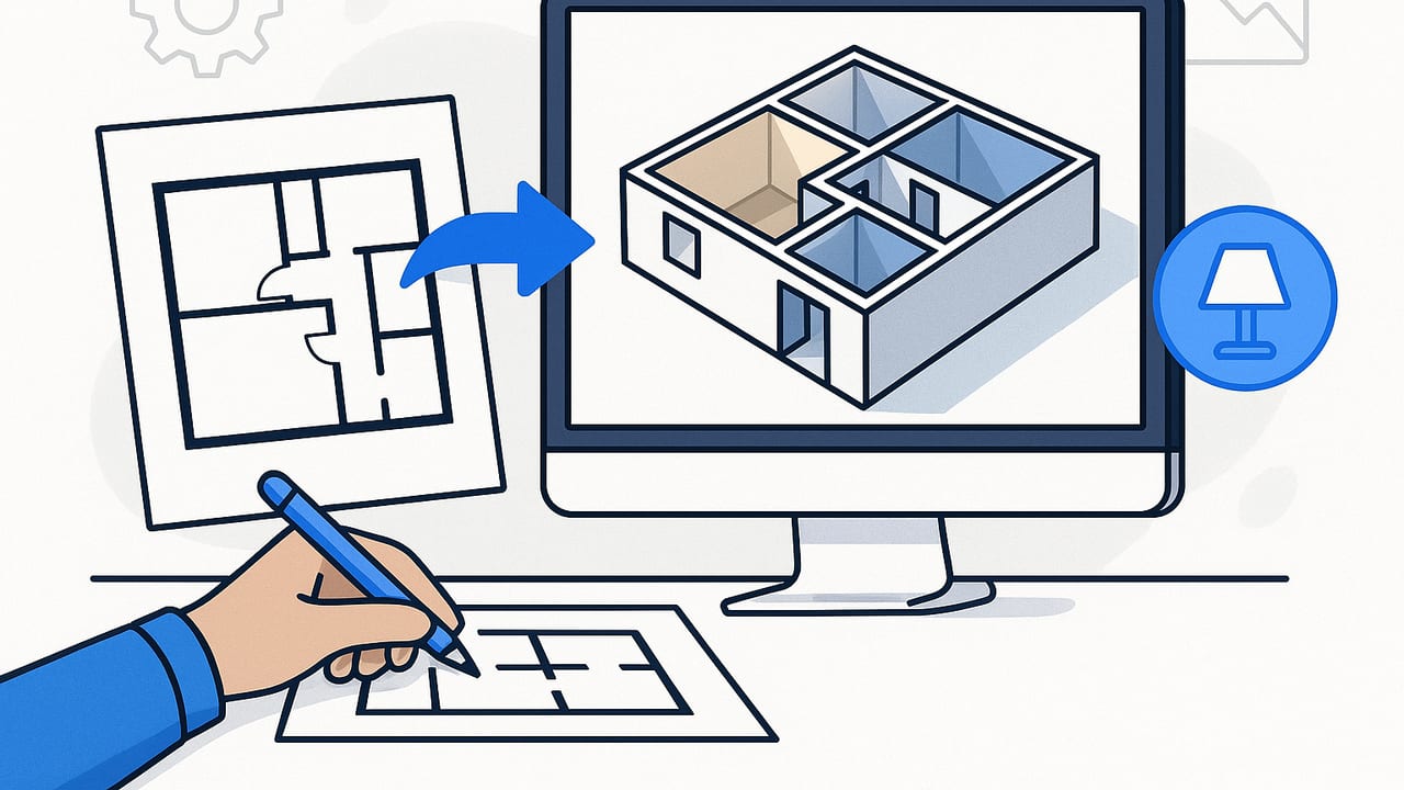
A compelling floor plan render turns abstract lines into an understandable, persuasive picture of space. Whether you are validating layouts, presenting to clients, or planning your own home, high-quality rendered floor plans communicate intent at a glance. This guide walks through the full pipeline—from preparing a 2D plan to exporting a polished visual—so your render is not only beautiful, but dimensionally trustworthy.
What Is a Floor Plan Render?
A floor plan render is a visually enriched representation of a 2D layout that uses 3D geometry, materials, lighting, and camera choices to show spaces, circulation, and function. Unlike a plain technical drawing, a rendered floor plan can include realistic materials, soft shadows, furniture, and decor. The goal is to preserve scale and proportions while making the design readable, inviting, and decision-ready.
Prepare the 2D Plan: Clean, Scale, and Clarify
Strong renders start with clean inputs. Before you model or convert anything, ensure your base plan is reliable.
- Collect sources: Original CAD (DWG/DXF) is best. If you only have paper, scan at 300–600 DPI. For phone photos, shoot head-on, well-lit, and avoid lens distortion.
- Remove noise: Erase smudges, construction notes not needed for modeling, duplicate lines, and overlapping annotations.
- Confirm scale: Identify a known dimension (e.g., a 3000 mm wall). If the drawing has no scale bar, measure multiple known elements for cross-checking.
- Clarify structure: Mark load-bearing walls, columns, and shafts; distinguish them from partitions.
- Capture openings: Note door swing directions, window head/heights, and sill levels if available.
Raster vs. Vector
- Vector (DWG/DXF/SVG): Precise, layer-based, and easiest to convert directly to 3D.
- Raster (JPG/PNG/PDF scans): Requires tracing or AI extraction; verify scale carefully.
Convert to 3D: Method Comparison
There are three common paths to a floor plan render. Choose based on accuracy needs, time pressure, and available tools.
| Method | Speed | Accuracy | Best For | Notes |
|---|---|---|---|---|
| Manual CAD/BIM modeling | Slow–Medium | High | Construction-level, detailed interiors | Full control of layers, materials, parametric elements |
| Semi-automated tracing | Medium | Medium–High | Concepts, quick iterations, small projects | Trace walls/doors/windows, apply templates |
| AI/computer vision conversion | Fast | Medium–High | Rapid visualization, proposal images | Verify and correct dimensions post-conversion |
Accuracy-First Workflow
Renders are persuasive. Make sure reality matches persuasion.
- Set the correct scale: Use the longest known dimension to reduce percentage error. Scale the entire drawing once at the start.
- Model wall centerlines or faces: Stay consistent. Typical interior walls: 90–120 mm; exterior: 200–300 mm. Always confirm from spec.
- Place structural elements: Columns, beams, and shafts first; they are the skeleton that downstream objects reference.
- Add openings with exact dimensions: Door widths (e.g., 810–910 mm common residential), swing radius, and window widths/heights.
- Set finished floor level (FFL) and ceiling height: Typical residential ceiling: 2.4–2.7 m, but verify. Ceiling height influences camera feel and light.
- Assign room types: Tag rooms (Kitchen, Living, Bath) to automate fixtures and material presets later.
Pro tip: Lock a “Scale Check” dimension in the model. If edits ever drift, you will catch it instantly.
Materials and Lighting: Make It Believable, Not Busy
Great materials and lighting create clarity without clutter. Aim for physically plausible values and restrained contrast.
Material Setup
- Use PBR textures with base color, roughness, and normal maps for realism without heavy render noise.
- Keep albedo realistic: Over-white materials cause glare. Lean on midtones for clean reading.
- Repeat and scale: Correct texture scale (e.g., 150 mm tile, 180 mm wood plank) grounds the render in reality.
| Material | Suggested Albedo (sRGB) | Roughness |
|---|---|---|
| Painted drywall (white) | ~0.75–0.80 | 0.4–0.6 |
| Oak floor (light) | ~0.45–0.55 | 0.5–0.7 |
| Concrete (medium) | ~0.45–0.55 | 0.6–0.8 |
| Ceramic tile (matte) | ~0.55–0.65 | 0.4–0.6 |
| Stainless steel | ~0.55–0.65 | 0.1–0.2 |
Lighting Setup
- Daylight first: Use a sun/sky system. Set geographic orientation to align shadows with the site plan if known.
- Soft fill: Add low-intensity area lights to reduce deep shadows under cabinets and furnishings.
- Avoid blown whites: Clamp highlights or reduce exposure. Midday sun can be harsh—try morning/late afternoon angles for pleasant shadows.
- Consistent light temperature: If you enable artificial lights, keep color temperatures plausible (e.g., 2700–3000K for warm residential).
Camera and Composition for Floor Plan Renders
The camera choice drives readability. Two common approaches are axonometric (isometric) and perspective cutaways.
- Axonometric/top-down: Clean, dimensionally honest, ideal for furniture planning. Keep a slight tilt (10–20°) for depth.
- Perspective cutaway: More immersive, great for marketing. Balance field of view (35–50 mm equivalent) to avoid distortion.
Maintain a consistent camera height (e.g., 2000–2400 mm for cutaways) and clipping plane just above sill level so walls read as outlines but furniture remains visible.
Style Passes
- Clay render: Single material to check geometry and lighting before textures.
- Hybrid plan: Thin outlines + materials to keep technical clarity while staying photoreal-light.
- Annotation overlay: Add dimensions, room names, and north arrow as a post-process layer for flexibility.
Furniture and Circulation: Dimensions That Sell the Plan
Use furniture as a scale cue and a layout validator. Stick to standard sizes and leave walkable paths.
- Clearances: Main circulation 900–1100 mm; between coffee table and sofa 400–500 mm; bed sides 600–760 mm.
- Doors: Leave 300–450 mm of latch-side clearance and keep arcs free of obstacles.
- Dining: Chair pull-back 600–760 mm; table to wall 900 mm minimum for comfort.
- Kitchen: Work aisle 1000–1200 mm; island clearance 1000–1200 mm; triangle legs 1200–2700 mm each.
- Bathrooms: WC centerline 400 mm from side wall; front clearance 600–760 mm; shower min 900 x 900 mm if possible.
QA Checklist: Keep the Floor Plan Render Honest
Before export, validate the model against the original 2D plan.
- Scale verification: Check at least three distances (long, medium, short). Tolerance: within ±1% for concept renders, tighter for construction visuals.
- Overlay test: Export a wireframe and overlay onto the original plan at 50% opacity. Edges should align at walls and openings.
- Room area check: Compare computed room areas to the schedule; deviations >2% indicate a scale or thickness issue.
- Door swings: Confirm no collisions with furniture or adjacent doors.
- Lighting sanity: No black pits or blown highlights; adjust exposure and bounce light as needed.
Exporting: Resolution, Formats, and Naming
Delivery specs depend on where the floor plan render will live. Plan exports by medium.
| Use Case | Aspect Ratio | Recommended Resolution | Format |
|---|---|---|---|
| Email or slide decks | 16:9 | 2560 x 1440 | PNG (transparent if overlay), JPG if photo-heavy |
| Print (A4/A3) | Varies | 3508 x 2480 (A4 at 300 DPI) | PDF for vector overlays, TIFF/PNG for images |
| Social (Feed) | 4:5 or 1:1 | 2048 x 2560 (4:5) | JPG high quality (85–92%) |
| Web portfolio | 3:2 or 16:9 | 2400–3200 px on long edge | WebP/JPG with compression balance |
File Naming
Use consistent, sortable names. Include project, level, view, and version.
PROJECT-LEVEL-VIEW-V##.ext
RiversideApt-L02-FloorPlanRender-AXO-V07.png
Common Mistakes and How to Fix Them
- Problem: Furniture looks cramped. Fix: Reduce piece sizes to realistic dimensions, increase circulation to at least 900 mm in main paths.
- Problem: Render feels flat. Fix: Introduce a soft key light angle, add ambient occlusion, and vary roughness to create micro-contrast.
- Problem: Materials appear “plastic.” Fix: Lower albedo, increase roughness slightly, and use normal maps for texture detail.
- Problem: Walls misalign with the original drawing. Fix: Recheck scale, lock a reference dimension, and adjust wall thickness consistently.
- Problem: Overly busy annotations. Fix: Keep critical dimensions and room names only; push the rest to a technical sheet.
Mini Workflow: Two-Bedroom Apartment Example
- Ingest the plan: Import a vector DWG. If you only have a scan, deskew and scale it using a 3000 mm reference wall.
- Walls and structure: Extrude exterior walls at 250 mm, interior partitions at 100 mm. Place columns at grid intersections.
- Openings: Insert 900 mm entry door, 810 mm bedroom doors, 1500 mm wide windows at 900 mm sill height.
- Levels: Set FFL to 0.00, ceiling to 2.6 m. Create a clipping plane at 1.2 m for the top-cut view.
- Rooms and materials: Living/dining get light oak floor; bedrooms use carpet; kitchen uses 600 x 600 mm tile; baths use non-slip tile.
- Furnish: 2100 mm sofa, 1400 x 800 mm dining table, queen bed 2030 x 1520 mm with 700 mm on both sides, 1600 mm vanity in bath.
- Lighting: Sun at 35° altitude, east orientation for soft morning shadows; add subtle area lights near kitchen upper cabinets.
- Camera: Axonometric with slight tilt, 10° above plan; frame the entire unit leaving 5% margin.
- Style pass: Start with clay render to confirm shadows; then enable materials and thin outlines for legibility.
- QA: Measure living room long wall (expected 5200 mm; measured 5188 mm, within -0.23%); overlay wireframe; adjust a misaligned bedroom door by 20 mm.
- Export: Two versions: client-marketing (PNG, 3200 px wide) and annotated technical (PDF with vector dimensions).
Automation and Reuse Tips
- Presets: Save material and lighting presets per project type (rental, luxury, hospitality) for consistent look and speed.
- Furniture libraries: Use parametric families with standard sizes and finish options to maintain scale fidelity.
- Batch exports: Establish a naming and versioning script so teams can find “the latest” quickly.
# Pseudo-bash for automated naming
project="RiversideApt"
level="L02"
view="FloorPlanRender-AXO"
ver="V08"
outfile="${project}-${level}-${view}-${ver}.png"
render_engine --scene scene.rnd --output "$outfile" --width 3200 --height 2000
Style Choices: Minimal vs. Photoreal
Decide how much realism your audience needs:
- Minimalistic plan render: Flat colors, subtle shadows, thin outlines. Fast, clear, perfect for quick decisions.
- Photoreal plan render: Detailed textures, realistic light, decor. Ideal for marketing and client buy-in.
Hybrid approaches often win: soft materials with restrained textures, accent shadows, and legible annotations.
Final Review Checklist
- Scale and three key dimensions verified
- Room names and areas confirmed
- Door swings and clearances collision-free
- Consistent material palette and texture scale
- Exposure balanced, no harsh clipping
- Exported in correct aspect ratio and resolution
A well-executed floor plan render blends accuracy, clarity, and atmosphere. With a disciplined setup and QA routine, you can iterate faster and deliver visuals that help stakeholders make confident decisions.
If you prefer a streamlined path from black-and-white drawings to 3D visuals on mobile, the iOS app Floor Plan to 3D can convert scanned or photographed layouts into dimensionally faithful renders and export high-resolution images for proposals.
