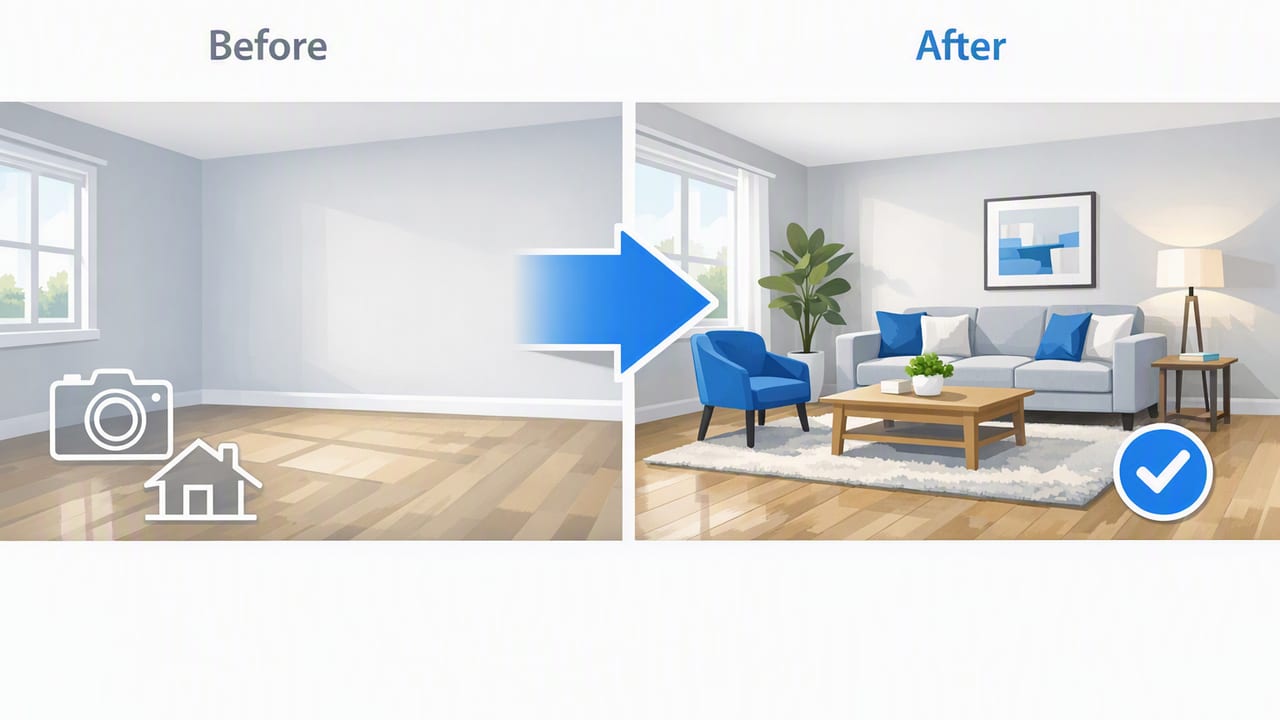
Empty room staging is the fastest way to help buyers, renters, or renovation clients “see” how a space actually works—without moving a single piece of furniture. The challenge is that empty rooms are deceptively hard to read: scale feels ambiguous, traffic flow isn’t obvious, and even large rooms can look smaller in photos.
A reliable approach starts with what you already have: a floor plan. When you treat the plan as the source of truth for dimensions and layout, your staging becomes more than decoration—it becomes a spatial explanation. This guide walks through a practical, floor-plan-first workflow for realistic staging visuals, including furniture sizing rules, layout patterns, and a checklist for export-ready 3D renders.
What “empty room staging” actually solves (and why floor plans matter)
Empty rooms often trigger the same questions:
- “Will my sectional fit?”
- “Where would the dining table go without blocking the patio door?”
- “Is this bedroom big enough for a queen and a dresser?”
Traditional staging answers those questions with real furniture. Empty room staging answers them with accurate visualization—ideally grounded in the original plan’s proportions, wall lengths, and openings.
A floor plan provides:
- Scale anchors (dimensions, door widths, window spans)
- Constraints (clearances, swing paths, built-ins)
- Truthful layout logic (where furniture can realistically live)
Step-by-step workflow: from floor plan to staged 3D views
This workflow is designed for agents, designers, remodelers, and homeowners who want consistent results without heavy 3D software.
1) Validate the floor plan before you stage
If your staging is based on a plan with missing or wrong information, everything downstream looks “off.” Do a quick validation pass:
- Confirm key room dimensions (length, width, ceiling height if available)
- Mark door swings and check they don’t collide with furniture
- Locate windows and radiators (or any obstructions) that affect placement
- Identify circulation paths between entries, hallways, and exits
Rule of thumb: If you can’t explain how someone walks through the room, you’re not ready to stage it.
2) Choose a staging goal: lifestyle, scale, or renovation story
Empty room staging works best when it has a clear purpose. Pick one primary goal per room:
- Lifestyle staging: show how the room is used (reading nook, family movie zone, work-from-home corner).
- Scale staging: prove that the space fits common furniture sizes (queen bed + nightstands, 6-seat dining table).
- Renovation staging: preview a change (open-concept proposal, new kitchen layout, converting a den to a bedroom).
When you try to do all three at once, you often overfill the room and lose clarity.
3) Build a “furniture kit” with standard dimensions
To keep staging realistic, use furniture footprints that match real products. Here are common starting points:
| Item | Typical Size (W x D) | Notes for Staging |
|---|---|---|
| Sofa (3-seat) | 84–96 in x 34–40 in | Leave 16–18 in to a coffee table |
| Sectional | 100–130 in overall | Watch doorway clearance and corner windows |
| Queen bed | 60 in x 80 in | Add ~24 in per side if using nightstands |
| Dining table (6 seats) | 72 in x 36–40 in | Try for 36 in clearance around table |
| Desk | 48–60 in x 24–30 in | Show a chair pull-back zone behind it |
Why this matters: viewers can sense when a bed or sofa is “too small” for the room. Using standard footprints creates instant credibility.
4) Place furniture using clearance rules (the realism shortcut)
Great empty room staging is mostly about space around furniture. Use these clearance targets:
- Main walkways: 36 in (minimum), 42–48 in (comfortable)
- Behind dining chairs: 36 in (tight), 42 in (ideal)
- Bed sides: 24 in (minimum), 30–36 in (ideal)
- In front of wardrobes/dressers: 30–36 in
- TV viewing distance: about 1.5–2.5× the TV diagonal (rough guide)
If you follow clearance rules, the layout almost “designs itself,” and your staging becomes defensible in a renovation or listing conversation.
5) Stage for the camera: pick angles that explain the room
The biggest mistake in empty room staging is rendering a pretty angle that hides the room’s logic. Instead, pick views that answer the viewer’s questions.
- Primary corner view: shows two walls and the main furniture grouping.
- Opposite corner view: reveals circulation paths, doors, and windows.
- Plan or dollhouse view (optional): clarifies the full layout at a glance.
For each room, aim for 2–3 images that collectively communicate: function, scale, and flow.
Room-by-room empty room staging patterns that work
Living room: define a “conversation rectangle”
Instead of pushing furniture to the walls, anchor the space with a rug-sized zone:
- Place a sofa facing a focal point (TV wall, fireplace, window view).
- Add two chairs or a loveseat to complete a U or L shape.
- Use a rug that’s large enough for at least the front legs of seating to sit on it.
Staging tip: leaving a clear path from entry to hallway immediately makes the room feel bigger.
Bedroom: prove the bed fits (and the room still works)
Bedrooms sell on comfort and storage. The quickest proof is a correctly sized bed with realistic clearances.
- Center the bed on the longest uninterrupted wall when possible.
- Add two nightstands if the width allows; otherwise, use one plus a floor lamp.
- Include a dresser only if you can keep 30–36 in in front of it.
Dining area: show seating count without crowding
Dining is a classic “empty space problem.” Make the seating count obvious:
- Use a table size that matches the room’s proportions (don’t under-scale).
- Keep chair spacing consistent so the viewer can count seats quickly.
- Align the table with lighting or architectural cues (pendant, window, opening to kitchen).
Home office or flex space: label the intent
Flex spaces confuse buyers unless you commit to one use. Stage it as:
- Office (desk + storage)
- Nursery (crib + rocker)
- Guest room (daybed + desk)
Staging tip: include one “identity object” (e.g., crib, drafting desk, treadmill) that makes the use unmistakable.
Common empty room staging mistakes (and how to avoid them)
- Wrong scale: furniture that looks doll-sized or oversized. Fix by using standard dimensions from a furniture kit.
- Blocked doors and windows: a visual red flag. Fix by checking door swings and window access early.
- No circulation: layouts that require squeezing sideways. Fix by enforcing 36 in pathways.
- Over-staging: too many pieces to “fill” the room. Fix by staging the minimum needed to communicate function.
- Floating furniture: pieces not aligned to walls or each other. Fix by using consistent margins and alignment lines.
Choosing a staging approach: photos vs. 3D vs. hybrid
Empty room staging can be produced in several ways. Here’s a practical comparison.
| Approach | Best For | Pros | Cons |
|---|---|---|---|
| 2D floor plan furnishing | Quick layout proof | Fast, clear, cheap | Less emotional impact |
| 3D empty room staging | Listings, proposals, presentations | High realism, better buyer engagement | Needs careful lighting/material choices |
| Hybrid (2D plan + 3D views) | Renovations and client approvals | Best clarity + best emotion | More assets to manage |
Export-ready staging checklist (so your renders look “real”)
Before exporting images for a listing or a client deck, run this checklist:
- Lighting: consistent direction; avoid overly dark corners; keep white balance neutral.
- Materials: don’t over-gloss floors; keep fabric textures subtle.
- Camera height: ~48–60 in (eye-level) for most room views.
- Verticals: keep walls straight (avoid excessive wide-angle distortion).
- Declutter props: a few items for scale (books, plant) is enough.
- Resolution: export high enough for MLS or presentation without compression artifacts.
- Consistency: reuse the same furniture style across rooms for a cohesive story.
Optional: a simple naming convention for staging exports
If you’re producing multiple angles and iterations, consistent filenames save time.
project-address_room_view_style_revision.jpg

Example:
12OakSt_LivingRoom_CornerA_Modern_r03.jpg
FAQ: empty room staging from floor plans
Do I need exact dimensions to stage an empty room?
Exact is best, but you can still produce useful visuals with approximate dimensions if you’re transparent about it. For sales or renovation decisions, verify at least the main room sizes and the location of doors/windows.
How many staged images should I create per room?
Usually 2–3: one primary view, one secondary view that shows circulation, and an optional plan/dollhouse view for context.
What style of furniture should I use?
Choose a neutral style that matches the property: modern for new builds, transitional for broad appeal, or a style aligned with the architecture. Consistency across rooms matters more than trendiness.
Putting it all together
Effective empty room staging isn’t about filling space—it’s about proving how the space works. Start with a validated floor plan, stage with standard furniture dimensions, protect circulation paths, and render angles that explain function and scale. When you do, your visuals become a decision tool: for buyers imagining daily life, and for clients approving design changes.
If you prefer a floor-plan-first workflow on iOS, tools like Floor Plan to 3D & Home Redesign can help convert a black-and-white plan into clean 3D views you can use for staging-style previews.
