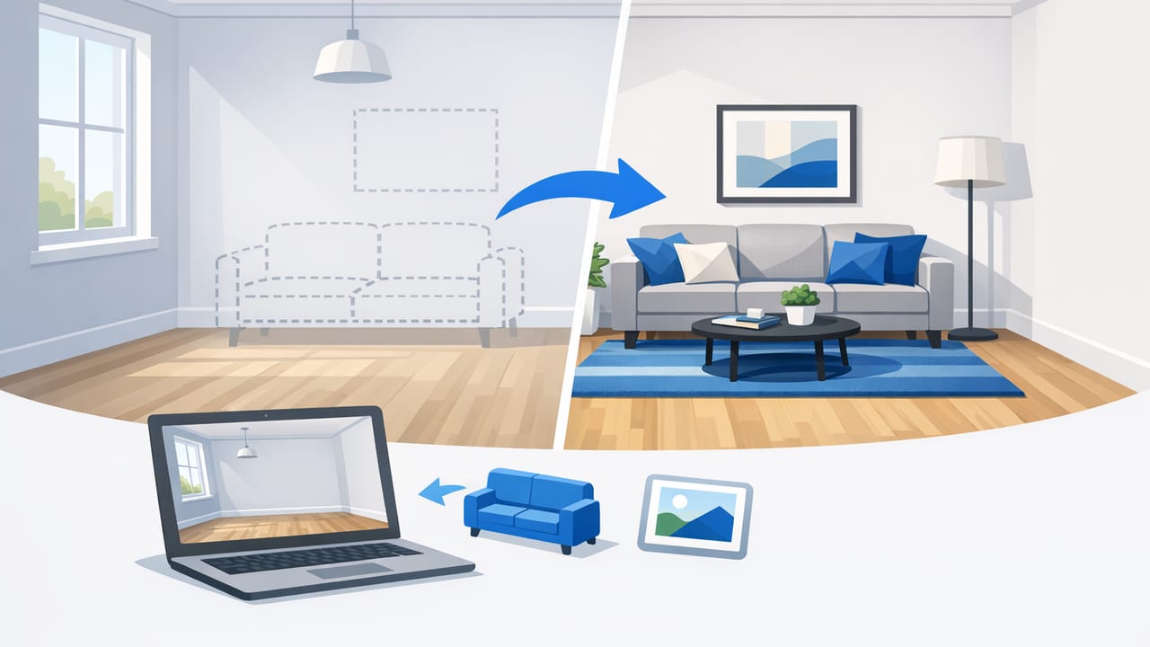
Empty rooms are honest—but they’re also hard to read. Without furniture, buyers and clients struggle to judge scale, imagine routines, and understand how a layout actually works. Empty room staging solves that problem by adding believable furniture, lighting, and decor to show how the space can function. Done well, it clarifies proportions, improves listing photos, and reduces “Will my sofa fit?” uncertainty.
This guide focuses on a practical approach: start with a floor plan (or blueprint), convert it into a clean 3D model, then stage key rooms with realistic layouts. The goal isn’t to create a fantasy interior—it’s to make the space legible, accurate, and emotionally inviting.
What “empty room staging” really means (and what it’s not)
Empty room staging is the process of adding context to a vacant room—typically with furniture, rugs, lighting, and a few accessories—to help viewers understand:
- Scale (how big the room feels with real objects inside)
- Circulation (how people move through doors, pathways, and around furniture)
- Function (where dining happens, where a TV wall could go, where a desk fits)
- Focal points (fireplaces, picture windows, feature walls)
It’s not interior design for its own sake. The best staging choices are supportive: they emphasize the room’s strengths, reduce confusion, and keep attention on the property itself.
Rule of thumb: If staging makes a room look stylish but hides the room’s size or layout, it’s not doing its job.
Why start with a floor plan (instead of “guessing” from photos)
Photo-only staging can look impressive, but it’s easy to misjudge depth, wall lengths, and door swings—especially in wide-angle shots. A floor plan-based workflow improves accuracy and consistency:
- Correct proportions keep furniture believable (no “tiny sofa in a huge room” effect).
- Repeatable views can be generated for multiple rooms with the same camera height and lens feel.
- Better planning supports renovation previews (e.g., removing a wall, shifting a kitchen).
- Faster iterations when you need two options (modern vs. traditional, office vs. nursery).
A step-by-step workflow: from plan to staged 3D renders
1) Prepare your floor plan for conversion
Whether your source is a scanned blueprint, a PDF, or a black-and-white marketing plan, clean inputs lead to cleaner 3D. Before converting, check:
- Legibility: walls, openings, and room boundaries are clear.
- Key labels: room names (Living, Bedroom, Kitchen) are visible.
- Dimensions: at least one reliable measurement (overall width, a room length, or scale bar).
- Door swings/windows: openings matter more for layout than decor does.
2) Convert the plan into a 3D base model
Once the plan is converted, verify fundamentals before you stage. Inaccurate geometry ruins trust quickly in empty room staging.
Accuracy checklist for the 3D base:
- Walls align with the plan (no drifting corners).
- Doors and windows are in the right positions and sizes.
- Room labels match the plan (to avoid staging the wrong function).
- Ceiling height is set (even an assumed standard) and consistent.
3) Decide the staging “story” (before placing furniture)
Every staged room should answer one question: How will someone use this space? Define a simple use-case per room:
- Living room: conversation + media
- Dining: seats 4/6/8
- Bedroom: queen or king + storage
- Spare room: office, nursery, or guest
This is also where you choose a light style direction (e.g., warm modern, minimal Scandinavian, classic transitional). Keep it broadly appealing and consistent across rooms.
4) Block furniture to scale (function first, styling second)
Start with big pieces and circulation. A reliable sequence:
- Anchor (sofa/bed/dining table)
- Support (side chairs/nightstands/storage)
- Flow (walkways, door clearance, drawer clearance)
- Finish (rugs, lamps, art, minimal accessories)
If you’re using an AI room planner, provide constraints: seating count, bed size, desk needs, and “must-keep” features (fireplace wall, bay window, existing kitchen island).
5) Choose camera angles that prove the layout
Empty room staging is most persuasive when it shows both space and circulation. Aim for:
- One wide view that explains the room (entry + focal wall).
- One functional view that proves usability (desk corner, dining clearance, bed walkway).
- One connection view if open-plan (kitchen-to-living relationship).
Room-by-room staging priorities (what to emphasize)
| Room | Primary goal | What to stage first | Common pitfall |
|---|---|---|---|
| Living room | Show gathering + sightlines | Sofa, rug, coffee table | Undersized rug that makes the room feel smaller |
| Kitchen | Clarify work zones | Stools, minimal counter items | Over-decorating counters (visual clutter) |
| Dining | Prove seating capacity | Table + chairs sized to clearance | Chairs pushed too close to walls/doors |
| Primary bedroom | Confirm bed size + storage | Bed, nightstands, dresser | Bed placed where doors can’t open fully |
| Small bedroom/office | Make “small” feel usable | Desk or twin/queen (pick one story) | Trying to fit everything (bed + desk + gym) |
Clearance rules that keep staging believable
You don’t need to be an architect to stage accurately, but you do need a few spatial “guardrails.” Use these as targets (not strict code):
- Main walkways: ~36 in / 90 cm when possible
- Around a bed: ~24–30 in / 60–75 cm on at least two sides
- Dining chair pull-back: ~36 in / 90 cm behind chairs
- Sofa to coffee table: ~16–18 in / 40–45 cm
- TV viewing distance: typically 1.5–2.5× screen diagonal
When space is tight, show it honestly but optimistically: choose slimmer furniture profiles, fewer pieces, and lighter visual weight (open legs, light colors, glass tops).
A staging brief template you can reuse (and share with AI tools)
If you collaborate with a renderer, a stager, or an AI workflow, a consistent “brief” reduces revisions. Here’s a simple structure you can copy and adapt:
{
  "project": "Vacant condo listing",
  "style": "warm modern (light oak, neutral textiles, black accents)",
  "must_keep": ["fireplace wall", "sliding balcony door"],
  "rooms": [
    {
      "name": "Living",
      "function": "seating for 4 + TV viewing",
      "key_pieces": ["84in sofa", "2 accent chairs", "8x10 rug", "media console"],
      "notes": "Maintain 36in path from entry to balcony"
    },
    {
      "name": "Bedroom",
      "function": "queen bed + storage",
      "key_pieces": ["queen bed", "2 nightstands", "dresser"],
      "notes": "Keep closet access clear; calm lighting"
    }
  ],
  "deliverables": {
    "images": ["wide", "functional"],
    "resolution": "3000px long edge",
    "format": "JPG (high quality)"
  }
}
Mistakes that make empty room staging look “off”
- Ignoring the plan: furniture that blocks doors, windows, or circulation breaks realism.
- Wrong scale: oversized sectionals in small rooms (or tiny rugs everywhere).
- Too many accessories: staging should clarify space, not decorate like a catalog spread.
- Inconsistent lighting: mixed color temperatures or unnatural shadows reduce trust.
- Camera distortion: ultra-wide views can mislead; balance openness with accuracy.
Exporting staged renders for listings, proposals, and presentations
How you export matters almost as much as how you stage. A few practical tips:
- Resolution: export high enough for cropping (often 2500–3500 px on the long edge).
- Consistency: keep similar brightness and white balance across rooms.
- Variants: consider two options for a key room (e.g., “office” vs. “guest room”).
- Context set: deliver a small, complete set (living, kitchen/dining, primary bed, flex room).
For renovation previews, include one “existing layout staged” image and one “proposed layout staged” image to help stakeholders compare changes without reading drawings.
FAQ: quick answers for better results
How many rooms should I stage?
Stage the rooms that sell the lifestyle: typically living, kitchen/dining (or the open-plan core), primary bedroom, and one flex space. Bathrooms usually need minimal staging.
Should I stage with trendy decor?
Use broadly appealing, timeless choices. Trends date quickly and can distract from the property’s features.
What if the room is awkward (angled walls, narrow layout)?
Use staging to explain the solution: choose narrower furniture, show a clear path, and emphasize a functional corner (reading nook, compact desk, banquette dining).
Putting it all together
Effective empty room staging is a communication tool: it translates measurements and blank walls into a believable daily life. When you start from a floor plan, convert to 3D, then stage with clearances and function in mind, your visuals become both attractive and trustworthy—ideal for listings, client approvals, and renovation previews.
If you want to try a plan-to-3D approach on iOS, an app like Floor Plan to 3D & Home Redesign can help generate quick 3D renders from black-and-white plans that you can then use as a base for staging concepts.
