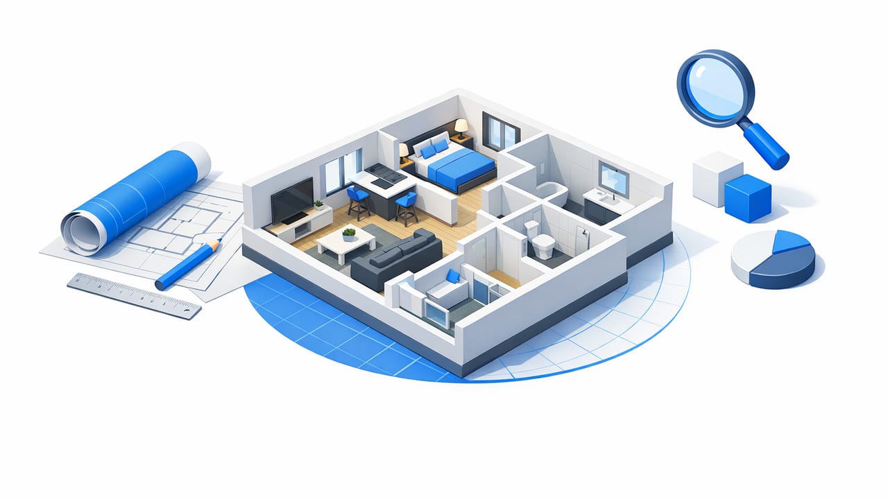
A 3d floorplan is more than a “pretty render.” It’s a communication tool that helps people understand space: how rooms connect, where circulation feels tight, how daylight might hit a kitchen, and whether furniture layouts make sense. The difference between a helpful 3D model and a confusing one usually comes down to a few practical decisions—validation, furnishing rules, lighting choices, camera viewpoints, and export settings.
This guide focuses on presentation-ready 3D floorplans built from 2D plans (scans, PDFs, or photos). You’ll learn a workflow that keeps the model faithful to the source while still looking polished enough for proposals, listings, remodel planning, or internal design reviews.
1) Start with the goal: what should the viewer decide?
Before you touch materials or décor, define what the 3D floorplan must answer. Different goals require different views and levels of detail.
- Remodel planning: show clear circulation, door swings, and “before vs after” options.
- Real estate marketing: prioritize cleanliness, bright lighting, and quick room comprehension.
- Client approvals: emphasize proportions, furniture fit, and an honest sense of volume.
- Contractor coordination: keep geometry accurate; visuals should reduce ambiguity, not add it.
Rule of thumb: If a visual choice makes the space look better but less truthful, it’s a marketing render—not a decision-making 3D floorplan.
2) Clean input plans for better AI interpretation
Whether you’re using AI conversion or manual tracing, input quality drives output quality. AI systems detect walls, openings, and symbols; noise in the plan becomes “guesswork” in 3D.
Best practices for scans/photos
- Flatten perspective: shoot straight-on, not at an angle. Avoid keystone distortion.
- Boost contrast: walls should be crisp black; the background should be clean white/near-white.
- Remove clutter: sticky notes, shadows, and fold creases often become false edges.
- Capture the legend and dimensions: even one known measurement can anchor scale.
What to do if the plan is “busy”
If you have a plan with heavy annotations, consider making a “presentation input” version: duplicate the file and erase furniture symbols, hatching, or notes that confuse edge detection. Keep structural lines, openings, and key dimensions.
3) Lock scale early (and re-check it later)
The fastest way to lose trust in a 3D floorplan is subtle scaling drift—hallways too wide, bedrooms slightly stretched, or doors that don’t feel like doors. Even small errors compound when you furnish the model.
A simple scale validation workflow
- Choose a reference measurement: an overall width, a labeled room dimension, or a known door size.
- Check 2–3 additional measurements: verify at least one interior wall run and one opening.
- Confirm consistent wall thickness: inconsistent thickness can signal detection errors or mixed standards.
If you want a quick way to quantify scale drift, you can compute the percentage error between the known dimension and the measured dimension from your model:
// percent error for a single reference
errorPercent = Math.abs(modelValue - knownValue) / knownValue * 100

// example: known = 4000mm, model = 3920mm
// errorPercent = 2.0%
As a practical target for a presentation-grade 3d floorplan, try to keep major dimensions within ~1–2% (and be even stricter if the visuals support construction decisions).
4) Add furniture with “fit logic,” not decoration
Furniture is where many 3D floorplans become misleading. Overscaled sofas, underscaled beds, and unrealistic spacing can make a plan feel “more spacious” than it is—or the opposite.
Furniture placement rules that improve credibility
- Respect circulation: keep main paths clear; avoid “squeezing” between furniture and walls.
- Use standard sizes: pick common bed, dining, and sofa dimensions for your region.
- Show functional clearances: space for chair pull-out, door swings, and cabinet openings.
- Limit props: too many decorative objects distract from spatial understanding.
When to use simplified furniture
For early-stage planning, simplified blocks often communicate better than highly detailed models. They keep attention on layout rather than style. Detailed furniture is most useful when the viewer is deciding between design directions (minimalist vs traditional, warm vs cool materials) and the geometry is already settled.
5) Choose lighting that explains the space
Lighting is not just aesthetics—it affects perceived size and clarity. A good presentation lighting setup makes room boundaries readable, corners visible, and surfaces balanced (not blown out or too dark).
Practical lighting setup for interior 3D floorplans
- Start with neutral daylight: soft, even light helps viewers understand proportions.
- Add minimal interior lighting: use subtle ceiling fixtures to prevent dark zones.
- Avoid extreme contrast: dramatic shadows can look cinematic but hide layout issues.
- Keep white balance consistent: mixed warm/cool lighting can make materials look wrong.
Materials: pick “honest defaults” first
Before you dial in premium finishes, set realistic baseline materials: matte white walls, neutral flooring, standard trim. This reduces visual noise and makes it easier to spot geometry problems (misaligned walls, gaps around openings, inconsistent ceiling heights).
6) Use camera views that match how people read plans
View selection is the main difference between a 3D model that looks impressive and a 3D floorplan that is understandable. Most viewers need one “map-like” view plus a few supportive angles.
Recommended set of views
- Top-down orthographic (dollhouse/plan hybrid): best for room relationships and navigation.
- 45° axonometric: helps non-technical viewers read depth without distortion.
- Two interior corner views per key room: shows how furniture fits and how the room feels.
- One circulation view: a hallway or open-plan path that explains flow.
Avoid these common camera mistakes
- Ultra-wide distortion: makes rooms look larger and curves straight lines.
- Camera too high: flattens the interior and hides furniture relationships.
- Over-staged angles: cinematic views may ignore the layout questions.
7) Add annotations that reduce back-and-forth
A good 3D floorplan presentation often includes light annotation. The goal is to prevent follow-up questions like “Which wall is new?” or “Is this a sliding door?” without turning the render into a blueprint.
- Label key rooms: especially in open-plan zones (kitchen/dining/living).
- Mark option differences: Option A vs Option B with short callouts.
- Include 1–2 critical dimensions: e.g., island clearance or hallway width.
- Use a legend for symbols: new wall, removed wall, glazing, built-ins.
8) Export settings: clarity beats file size (until it doesn’t)
Export choices determine whether your 3D floorplan stays crisp in a PDF, looks clean on a phone, or survives being dropped into a slide deck. Use the destination to guide resolution and format.
| Export Type | Best For | Notes |
|---|---|---|
| PNG | Slides, web pages, annotated markups | Sharp text/lines; larger files than JPEG |
| JPEG | Email sharing, quick previews | Smaller files; avoid heavy compression artifacts |
| High-res stills | Proposals, print handouts | Prioritize readability; test-print one page |
| Multiple viewpoints | Client approvals, comparisons | Keep camera positions consistent across options |
Consistency trick for option comparisons
If you’re presenting two layouts, reuse the same:
- camera position and height
- lighting setup
- material palette (unless finishes are the decision)
This isolates the variable you want feedback on: the layout itself.
9) Quality checks that catch 80% of issues
Before sending a 3D floorplan to a stakeholder, run a quick checklist. It’s faster than revising after someone points out “the bathroom door hits the vanity.”
Fast QC checklist
- Openings: do doors/windows match the plan count and approximate placement?
- Door swings: do they collide with furniture or block circulation?
- Room labels: are spaces clearly identified and logically named?
- Scale sanity: does a bed/sofa look like the right size in the room?
- Ceiling height consistency: any unexpected steps or odd proportions?
- Export test: open the output on the device your audience uses.
10) A simple end-to-end workflow you can repeat
- Prep the 2D plan: straighten, clean, increase contrast.
- Convert to 3D: generate walls/openings; fix obvious detection errors.
- Lock scale: validate with at least one known dimension + two cross-checks.
- Apply baseline materials: neutral, realistic defaults.
- Furnish with standard sizes: prioritize fit and clearance.
- Set lighting for readability: soft daylight + subtle interior fill.
- Capture a standard view set: top-down + axonometric + key interiors.
- Annotate lightly: labels, option markers, 1–2 critical dimensions.
- Export for destination: PNG/JPEG, high-res when needed.
- Run QC: openings, collisions, labels, and export readability.
Conclusion: make your 3D floorplan easy to trust
The best 3d floorplan presentations are the ones that help someone make a decision confidently. That usually means: validate scale, furnish responsibly, light for clarity, choose plan-readable viewpoints, and export with consistency. When those fundamentals are in place, the visuals look better and communicate more honestly.
If you’re building this workflow on iOS, tools like Floor Plan to 3D can help convert a black-and-white plan into a dimension-respecting 3D model you can export as high-resolution images for presentations.
